Here at Alloy, we’ve had the pleasure of working with a number of clients in the health and fitness industry, from nutritionists through to strength coaches, personal trainers and gyms. In the course of our work, and because we love fitness ourselves, we’ve looked into hundreds of different brands in this world, from solo trainers to national chains.
For those just getting started in this competitive industry, or those looking to revamp their presence, we thought it might be helpful to put together a few key tips to help fitness professionals get their branding spot-on. Perhaps you already have a good idea of how you’d like your branding to look, that’s great, but you’ll still want to be mindful of these practical steps to avoid rushing the process. Just like training, we all want to get the most out of our time and effort, so make it count with these tips.
How to design a fitness logo
First of all, start with the basics. What is the overall shape or layout of your logo going to be? Some people want a big circular logo, others prefer square designs, stars or something even more fancy. Whatever you preference, it’s really important to think about these things in a more practical way. Current web design trends tend towards a horizontal menu bar across the top or bottom of the screen. For this reason we often suggest to clients that they consider a rectangular layout for their branding. Of course, this doesn’t mean you can’t include larger or circular variations later on but you’ll need to get the essentials in place first with a design you can use across as many places as possible.
Fitness logo icons
These days, a key component of your logo is often the accompanying icon. This could be a shape, abstract image or illustration of an object. Generally we find that if you want to include an icon you should start coming up with ideas as early on as possible as it can take a while to pin down what you want, before you even get stuck into how you want it to look. In most logos that have an icon (and also look good) the font of the business name is going to be pretty simple. If however there isn’t an icon, which is fine, then the typography of the business name could be more elaborate, in this case, the business name is the logo.
Your logo and branding is communication
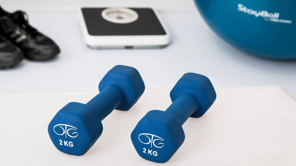
You logo or branding is likely to be one of the first things your audience sees when they visit your channels, so in a practical sense it’s your headline message to your customers. Think carefully about the imagery and typography you choose, it’s important to create something you personally like, but the choices you make will have a big impact on your audience. If your personal training business is built around helping beginners with their fitness, images of body building beasts and dumbbells might come over a little intimidating even if it makes it obvious you work in fitness.
Brand recognition
When we think about the big brands out there in the fitness world, from brands like Nike through to Gymshark and Pure Gym, many use a simple image for their branding. This is fine for established businesses who have already built up a level of familiarity among their customers. For younger brands and those just getting started however this can be a little confusing. Remember, your logo and branding has to give at least some impression of what it id that your business actually does, so if you’re new to the game it’s worth making sure that your customers understand what it is you do straightaway. This is especially true if your business name is a made up word or doesn’t hint at what you do.
That’s it for now. Stay tuned to our channels for more tips for fitness businesses. If you need a little more help with yours then reach out to the team for a more in depth chat and discover how our design team can help you. Our branding comes fully optimised for all social media marketing channels, header art profile images, websites, business cards, stationary, t-shirts, signage, flyers and more. Get in touch to get started on fitness branding to help you cut through the noise.