The challenge
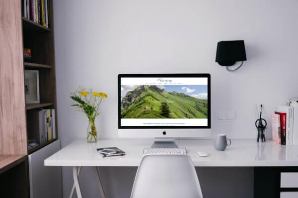
We were approached by a small, family-run catered chalet hire business in Les Gets, France. The owners had recently upgraded to a much larger chalet than their previous offering and as part of the process had decided to revamp their digital presence too. A redesign of the existing website was needed to appeal to the kind of higher end clients that the flashy new chalet would be targeted at. The redesign would have to be supported by carefully research into the search habits of their target customer, since beginning again with a new chalet presented some obstacles to their current search visibility.
A significant update was needed as the old site had not been updated in some time. Many of the design elements were extremely outdated including textured and skeumorphic elements not fitting with current web design trends. Any references to the couple’s previous chalet needed to be removed and replaced and the site required a careful eye to spot any remaining outdated or broken links.
The solution
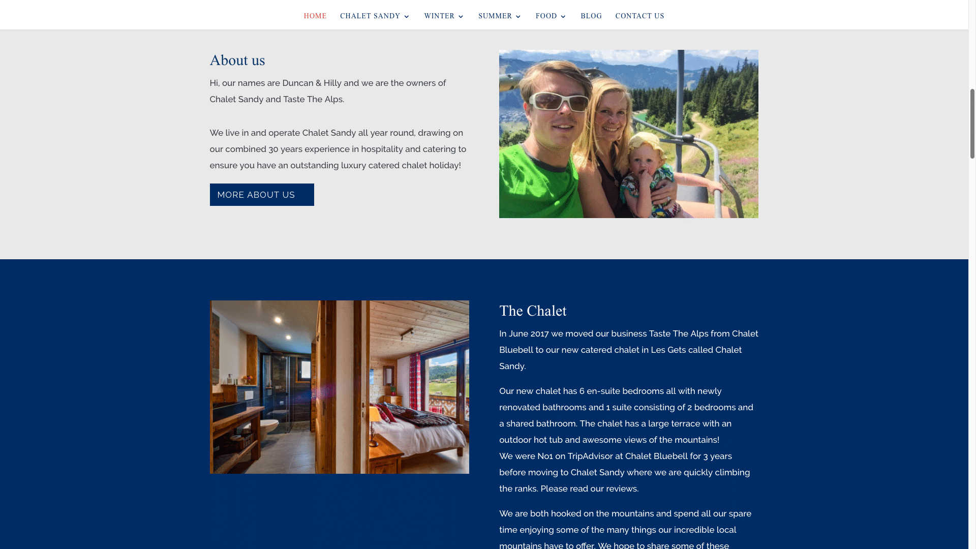
The redesign began with new brand guidelines. These formed the foundation of the whole processes, giving us a reference point to come back to for fonts and colours as well as helping the business’ owners to understand how to remain consistent in their branding in future. The guidelines included a more refined and simple dark blue colour palette and a smart serif font to impart an upmarket feel on the site.
Our SEO team carried out extensive keyword research to understand the relative volumes of searches people make when booking holidays and short breaks in luxury chalets such as this. Armed with this valuable information, key text and headers on the website could then be keyword optimised, ensure the best possible visibility for the new chalet. Links to relevant profiles on TripAdvisor and other popular review platforms were carefully updated and integrated to make it as easy as possible for new and existing customers to leave praise for the excellent offerings at the new chalet.
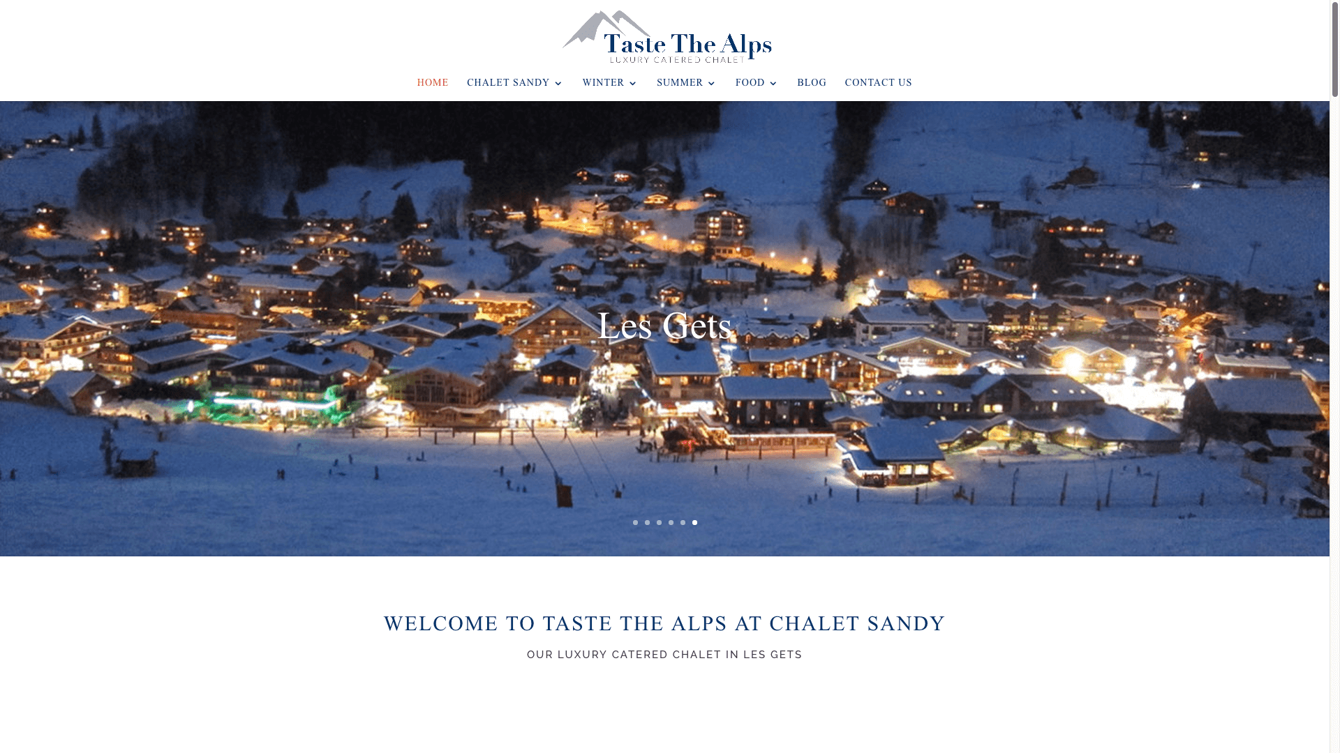
The website redesign for this property lettings company made much better use of the client’s existing photos, beautifully showing them off in large, auto-scrolling header images for visitors to see the moment they hit the website. All existing skeumorphic and outdated design elements were replaced with flat, material design elements; large blocks of single colours and non-textured backdrops. All in all, the changes created a luxury, high end, premium feel for the website, exactly what was needed to reflect the Michelin star dining and top quality accommodation on offer.
The details
- New brand guidelines drawn up including colour and font guidance
- Keyword research carried out to optimise headers and key text throughout the new site
- Skeuomorphic elements replaced with non-textured elements and flat colour blocks
- Social links and references to the old chalet were found and replaced site-wide
- Great photography used extensively throughout the site for a high-class feel

