The challenge
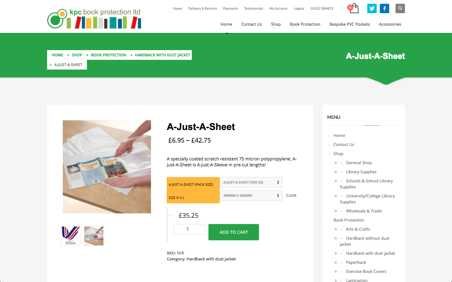
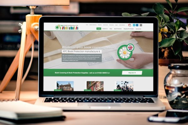
Having been successfully manufacturing book lamination products for a number of years, our client approached us about a redesign of their existing website. We had created their existing site 4 years ago, since then the company had worked with a number of prominent local businesses, schools and libraries as well as consumer customers. We had two goals here, to update the website’s appearance and to add further functionality to the eCommerce store.
The first stage of this required taking updated versions of the the client’s logo and preparing them for web use. Most of the work they had carried out had been for use in print design and we had to translate this new style to the website. The changes to the branding were subtle, however we needed to use these to make a big impact on the website while updating its look.
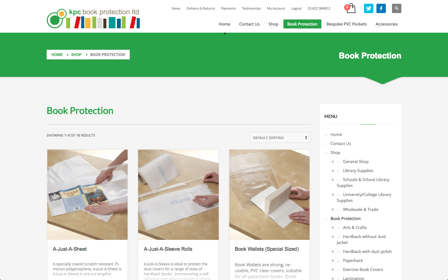
With such a wide variety of clients and a huge disparity in the sizes of orders that the website takes, we had to work closely with the client to establish what these different customer behaviours were. By combining our expertise in optimising web design for user experience with the client’s understanding of what their customers would want to do, we were able to set out a new navigational structure for the website.
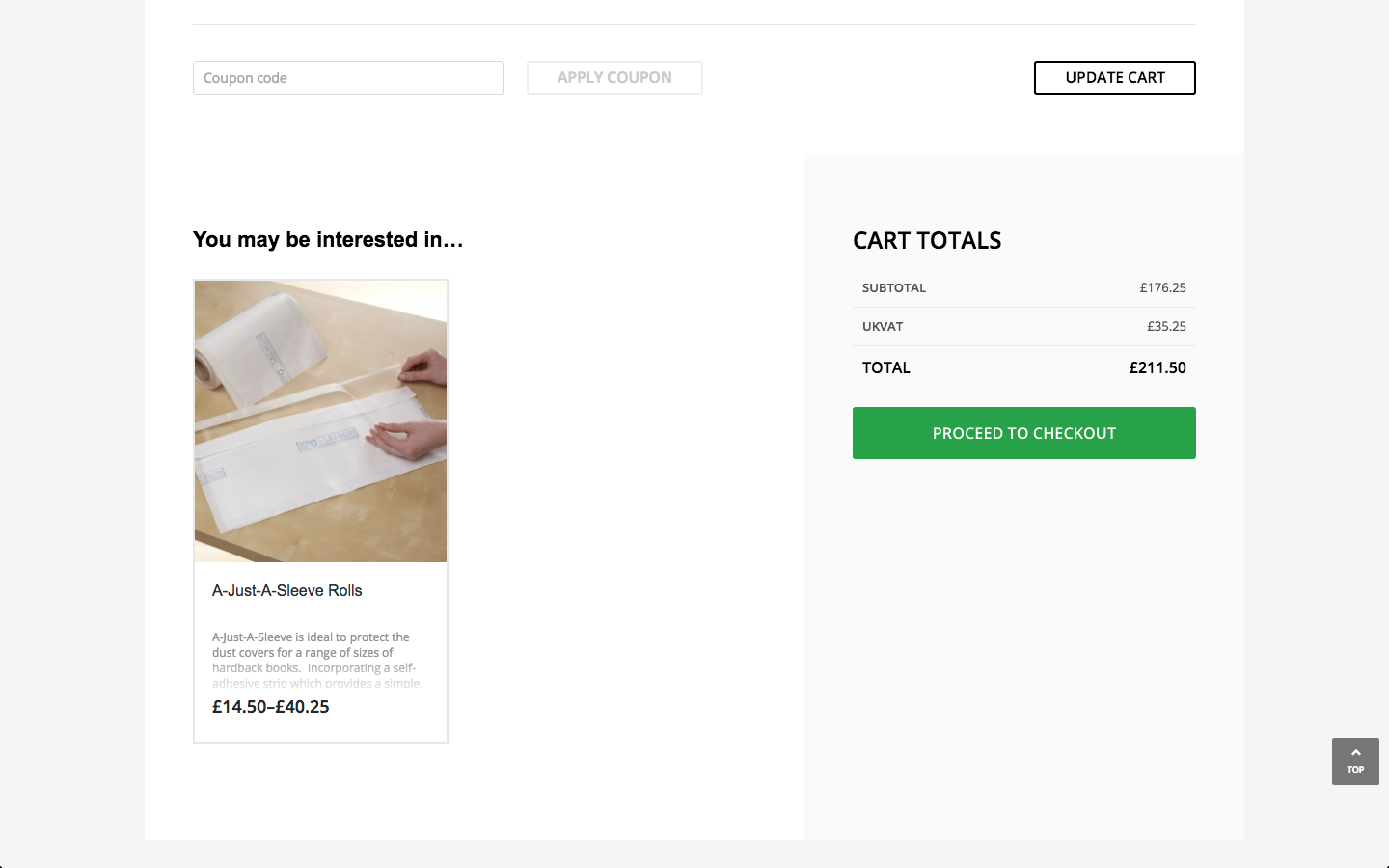
A nuance particular to this project was taking into account the different order processes for each type of customer. Selling to both wholesale and retail customers, as well as taking bulk orders from non-commercial organisations, required a variety of order and invoicing systems to be implemented. Naturally the implementation of this system would have to be seamlessly integrated with the company’s existing workflow with training provided to ensure that this additional functionality was able to improve efficiency as intended.
The solution
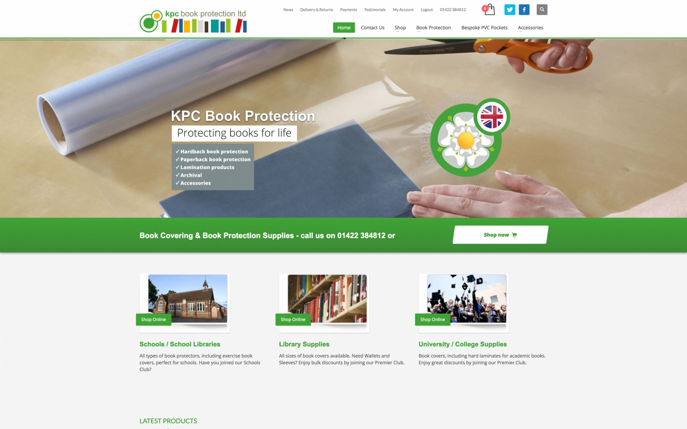
Our client was selling mainly to large organisations with little time to browse, so we focussed the new website design around the needs of these specific clients. It was important to display the contact details and eCommerce sections as prominently as possible to create a quick and efficient user experience for visitors to the site. By identifying the most important customer base and working closely with the client from the start to identify these goals, our optimisations became as effective as possible. We also built quick links into the homepage aimed at the key customers of our clients to further speed up their visits, the links took the user through to specific sections of the eCommerce area which dealt with their principal products.
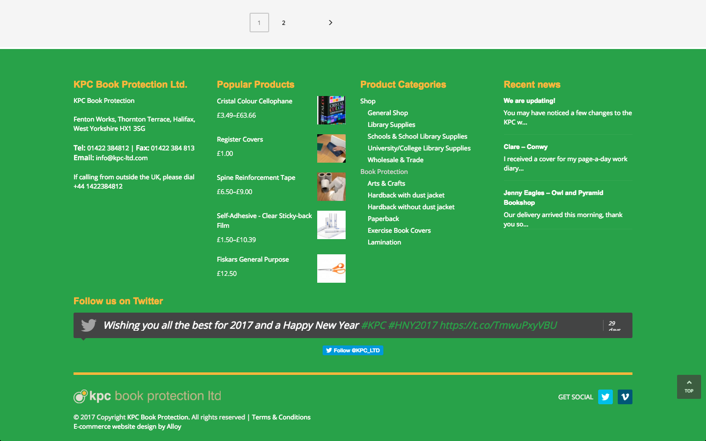
Changes to the menu structure and product hierarchy were carefully planned to ensure that the correct balance between colloquial names and the technical terms of products could be found. Our experience in establishing what a customer is looking for and how they look for it is as essential in SEO as it is in web design. While industry professionals may refer to the technically correct name of a product, this may not be the same name that a customer is looking for. By creating a clear structure, that enables customers to browse the site according to their needs, as well as according to the category of product, we made it as easy as possible for the right people to get to the right place. Other small tweaks, such as improving the use of social media icons in the header and footer of the website reflect the company’s growing social media presence, an avenue of marketing that is becoming more significant for many businesses like this.
Another key aspect of enhancing user experience is the design. Having built the original website for this client, we had strong foundations on which we could build. In this particular case the client had been making updates to their offline branding and felt that these developments needed to be carried through to the website. As the website had not been drastically updated for a few years, this gave us the perfect opportunity to make a few small changes that generated a big effect. Working closely with the client we were able to generate a version of the logo that would meet the needs of a responsive website and display well across a range of screen sizes. Our designers were able to interpret the client’s new offline branding and then translate this into the website’s design.
To get more technical, we implemented a flattened modern, material design, moving away from the previous skeuomorphic look of the site. Over recent years flat designs such as that used in Google’s branding have begun to take over and are now generally considered to be more legible and more effective at converting visitors. The new styling, combined with integrated social media feeds, showreels of the latest products and prominent branding brought the website firmly in line with the modern look.
The details
- Redesigned eCommerce site geared towards the needs of key customers.
- Flattened material design, updating the look of the website to 2017 standards.
- Full sales integration with multiple configurable options for products.
- SSL security certificate to secure the website for visitors, providing a boost to rankings with Google.
- Integrated social feed from Twitter and share links.
- Premium UK cloud web hosting with 1 minute uptime monitoring.

