The Challenge
We were approached by one of London’s leading personal trainers, a top level powerlifting and strength coach. With his personal brand going from strength to strength, we were asked to develop a modern, memorable logo which was fit to grow with it. While he had a previous logo style he felt it wasn’t up to scratch. His high value clientele would expect the same attention to detail in both his training programming and in his branding. The design needed to be crisp, clear and modern, suitable for both the client’s online channels as well as physical merchandise. The client was keen for a design that featured a logo element and text too, to enable its use in a variety of contexts.
In this sort of situation, the client is the brand, using personal experience and expertise to drive the business. The operative word in “Personal Trainer” is that a very personal service is being purchased. What set out client apart from the competition was his incredible value as a trainer. A key part of the long term marketing strategy would be asserting himself as a thought leader in his industry. His branding would have to ensure that he as a person and a brand could be easily associated with the high value content and informative content that he produces. This is of course taking for granted the fact that the logo isn’t just a name, it also has to explain, to a certain degree what the business does. We had to achieve all this without resorting to cliched illustrations of bulging biceps doing dumbbell curls.
The Solution
First of all, we set about investigating the lay of the land, identifying the key design trends for his specific sector of the health and fitness market. As keen fitness enthusiasts ourselves this was a world already quite familiar to us so we appreciate the nuanced difference between branding for a HIIT class and branding for a powerlifting personal training service. We assembled the logos of similar businesses into a competitor analysis document, breaking down the competition’s designs into their component parts in order to collect as much feedback from the client as possible. We looked at fonts, layouts, icons and colour palettes in order to get a complete picture of the current state of the industry.
The client provided a host of likes and dislikes from the pool of resources we collected, as well as providing some of their own. Throughout this process we gave continual feedback on the viability of the clients input. By analysing the designs and breaking them down we were able to build an understanding of the design features that the client liked most. Despite that fact that our customer had no technical knowledge or experience in logo design, our workflow meant the client always has a lot of input into the design process.
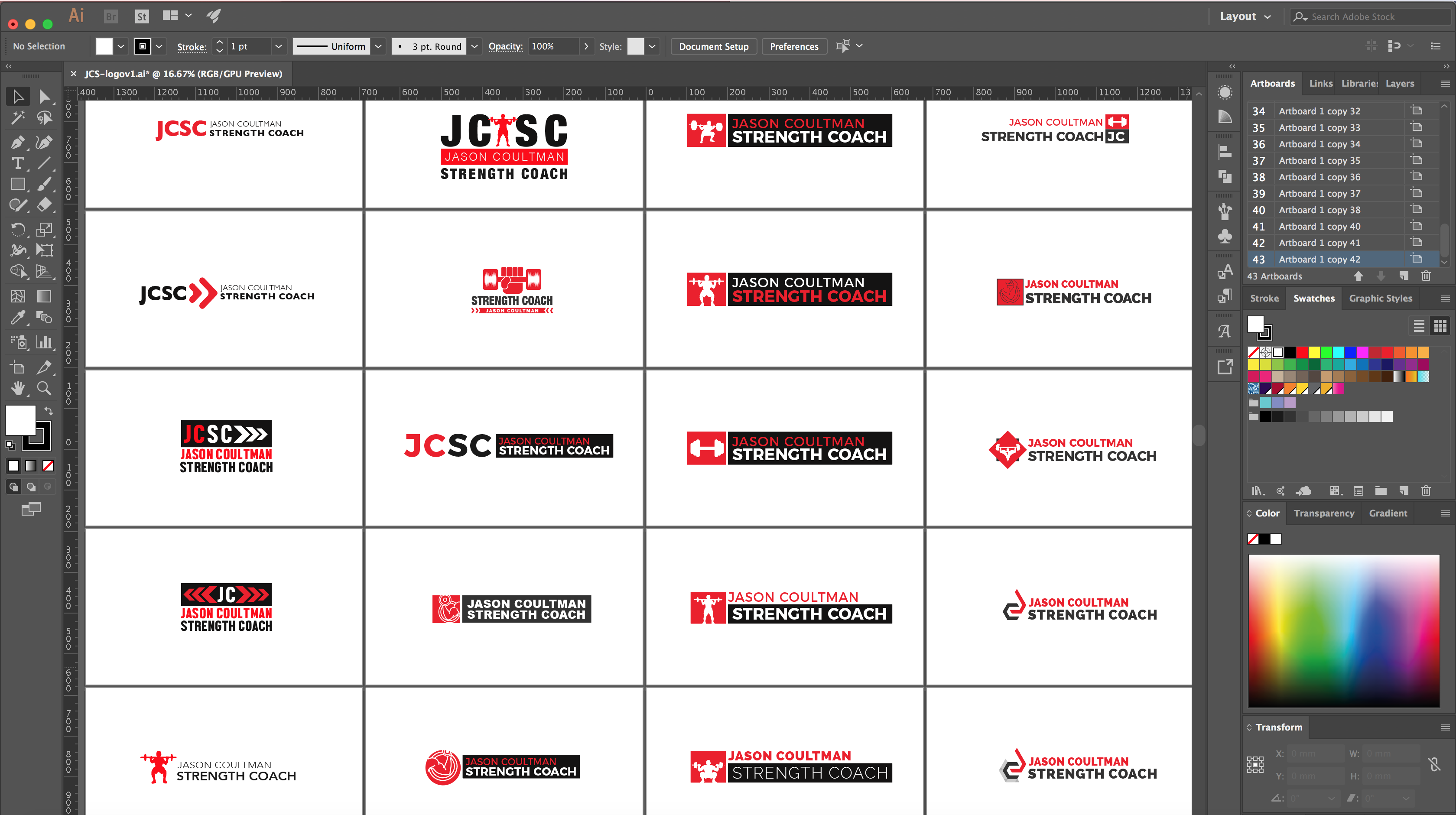
As per usual, we don’t identify exactly what form the final logo will take at this stage, but we ruled out a lot of options and came up with a fey key themes to explore. In this case we knew we’d be focussing on a red and/or blue colour scheme, with an icon that could be used in a round logo as well as on web design. The icon would either refer to one of the three big lifts (squat, bench press and deadlift) or be based around the initials of the business name.
After a couple of rounds of concepts we arrived at both a logo and text-based branding that fit perfectly with the client’s wishes. We don’t expect our clients to know whether a design will work or not just from talking about it, so we make sure we create as many concepts as possible. As the designs move forward, we hone in a the key design elements, making smaller variations to fine tune the logo. As we approached the final logo design for this project, we played around with applying the same colour palette to different sections of the logo and created mockups with slightly different relative sizes. These are the small changes that have a huge effect on the overall impact of the logo.
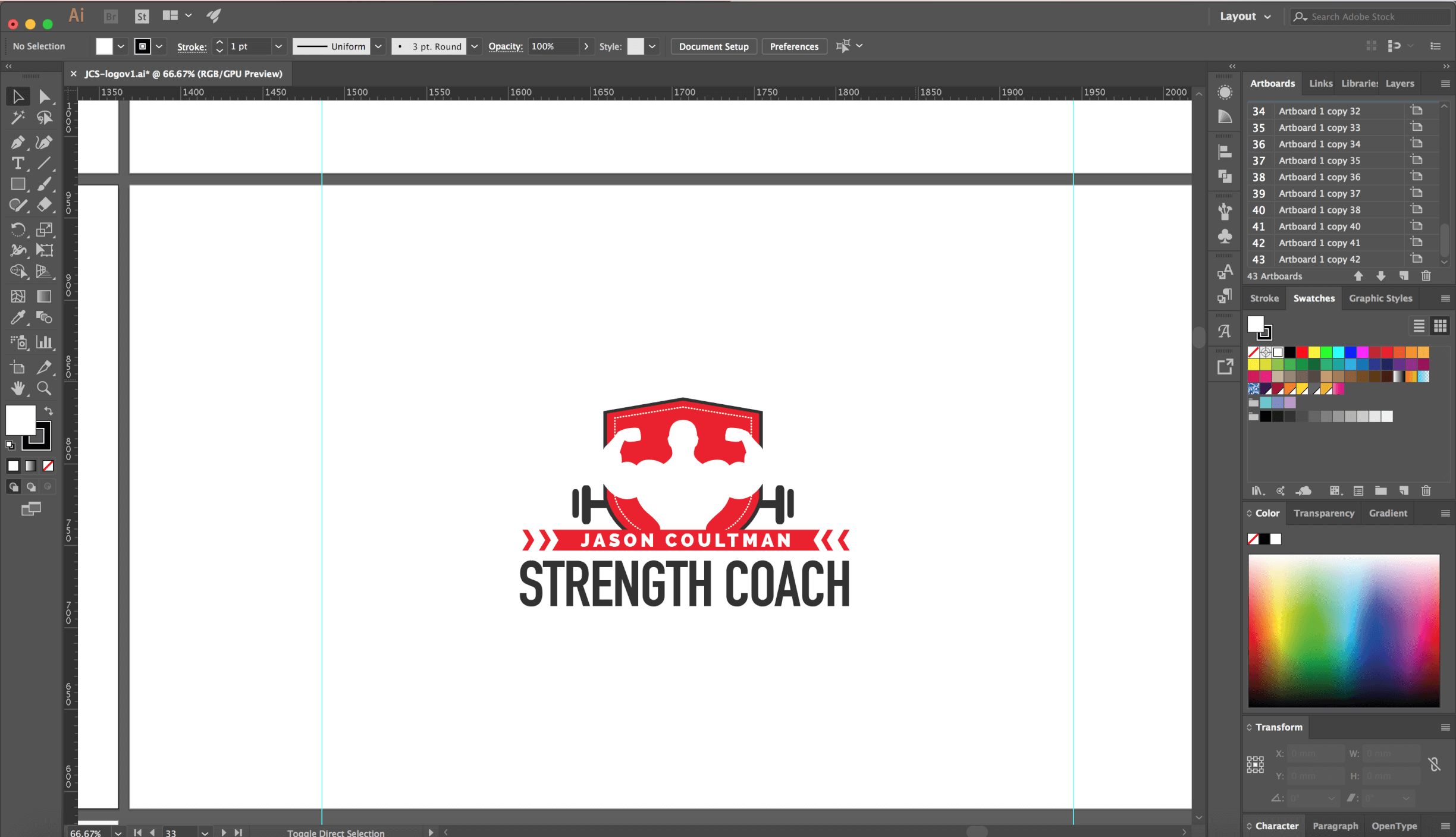
The flat, modern logo used a simple colour palette alongside high impact lettering, building on trends within the industry but also adding its own twist, perfect for standing out in a packed marketplace. With the new logo agreed upon, we delivered it in all appropriate formats; scalable vectors, web ready png and print ready files. We also implemented new branding across the client’s existing website, bringing it up to the same visual standard.
The Details
- Getting to know the client and the industry through comprehensive competitor research
- Discussion of research with client
- Presentation of first concepts, feedback from client
- Second round of concepts discussed, final logo agreed on
- Designs completed and delivered to client in print ready and scalable vector formats
- Designs rolled out across client’s digital channels
![]()