The Challenge
We were asked to develop a website for a new project management app. The app was designed for small to medium businesses to assist with their organisation including the tracking of time, wages and staff management.
Despite having a relatively in-depth feature set, the site would need to be extremely user friendly and clear in order to convince new users to try it out. In particular, features would need to be distilled into succinct feature highlights to avoid intimidating potential customers.
The Solution
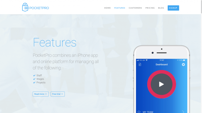
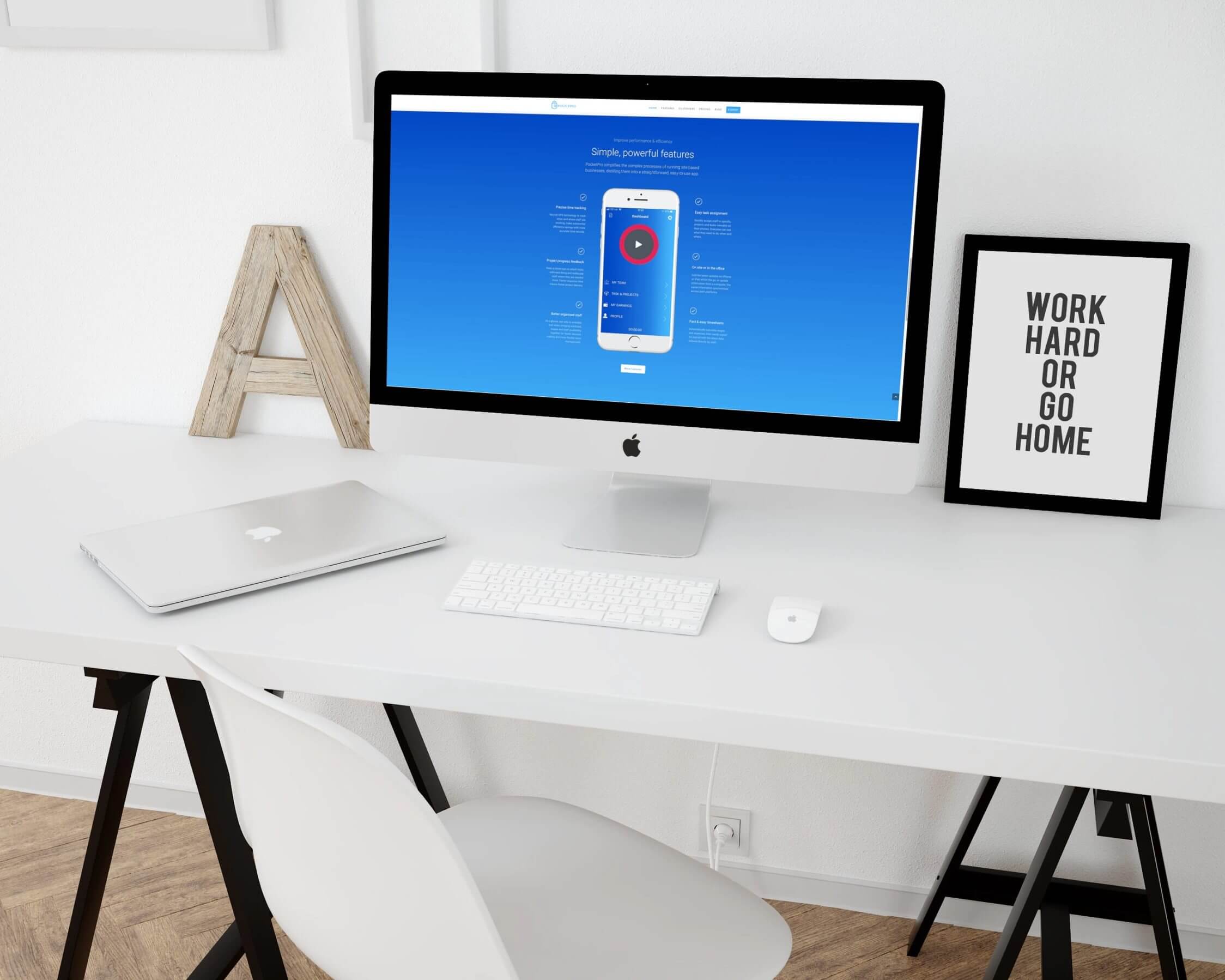
We drew heavily on the brand’s eye catching colours and our brief to create a website that matched the look and feel of the app as closely as possible. This sent a clear message to users of the site that they were in the right place, making browsing more comfortable and intuitive for those familiar with the app.
For those who hadn’t used the app yet, the new site oriented visitors in the language and styling of the brand, ensuring that when they came to use the app they would find the process as seamless and trouble free as possible.
A clean layout and simple navigation mirrored the great user experience offered by the app
The Details
- Brand guidelines created to ensure website matches app content
- Simple navigation and smooth performance using latest HTML5 coding
- Responsive design for flawless performance across mobile, tablet and desktop
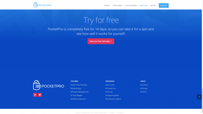
- Easily accessible pricing structure and contact information
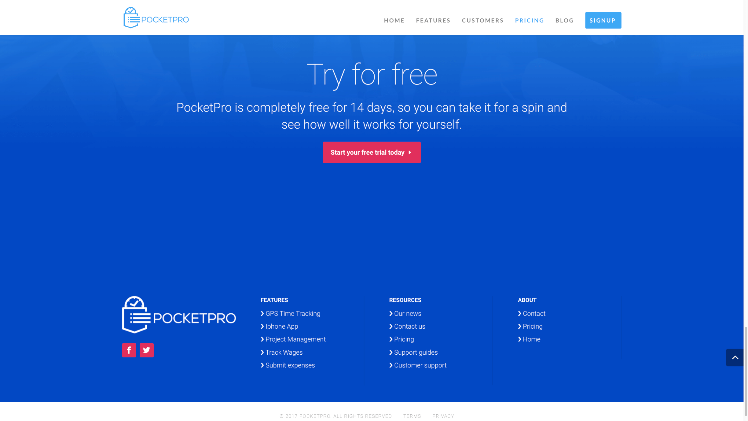
We designed the site around a philosophy of straightforward navigation, with a simple persistent header menu allowing users to easily find pricing pages and a contact form.
Providing a great user experience was vital to convince visitors of the value and quality of the app. Our experienced copywriters studied the app and effectively distilled its features into an accessible yet detailed description, perfect for a punchy website that immediately grabs the attention of its visitors.
The lower half of the pages offered further navigation options, allowing interested visitors to quickly and easily learn more

