The Challenge
We were approached by a new supplements company in need of an attention grabbing website to promote their latest products. The client was offering two products for sale, and each would require its own dedicated page as well as a page offering both products at a discount.
As the company was selling dietary supplements, the website needed to be very clear when it came to the ingredients of the products and preemptively address questions potential customers may have in order to achieve the best conversion rate possible. The site would need to be quick and easy to navigate across desktop, mobile and tablet since any perceived difficulties in site navigation could also negatively impact conversion rates.
The Solution
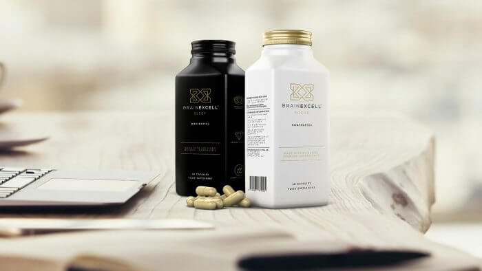
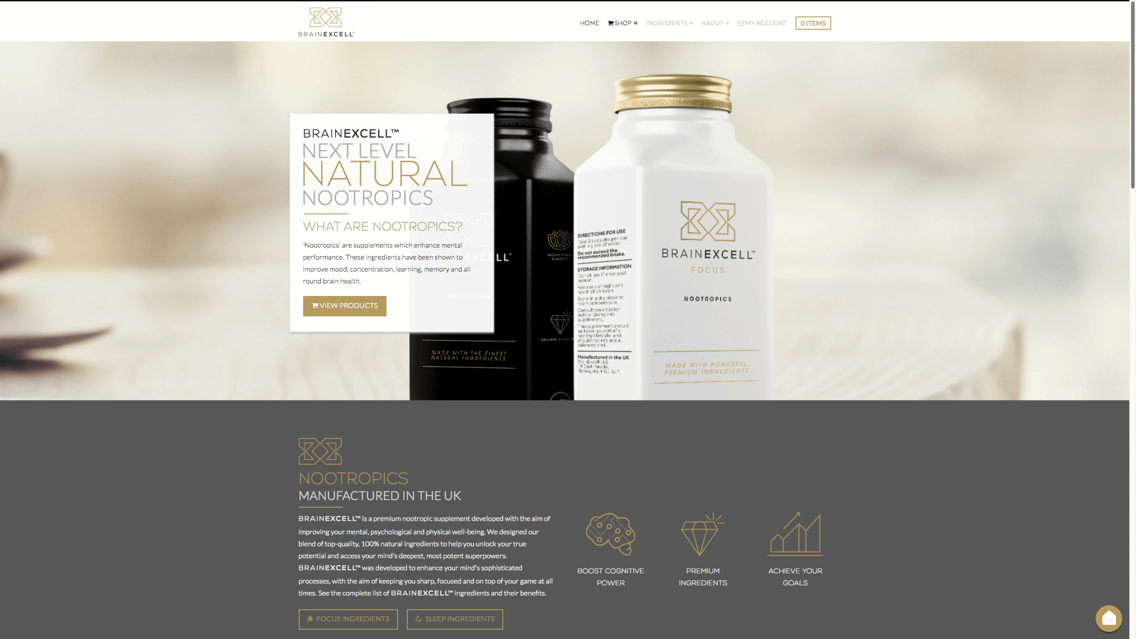
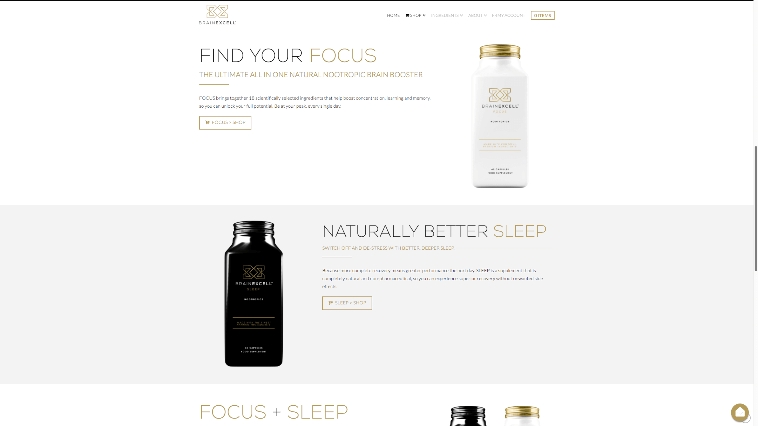
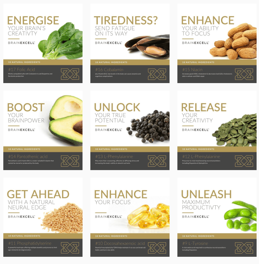
We drew upon the client’s great product images to create landing pages that were immediately engaging for visitors. A clear, persistent header and menu structure made the site exceptionally easy to navigate, ensuring the user experience was as quick and easy as possible. Each section of text on the site was followed by a navigation button allowing users to quickly move around the site and making the process of buying the products as seamless as possible.
The homepage of the new website linked prominently to further details regarding the product’s ingredients and also the shop pages; another technique employed to maximise the site’s conversion rate. A comprehensive FAQ section was built in to address common search queries of those searching for the products offered by the client. This is great for SEO and it helps to reassure potential customers of the quality and legitimacy of the company.
The Details
- Responsive layout focussed around great product images
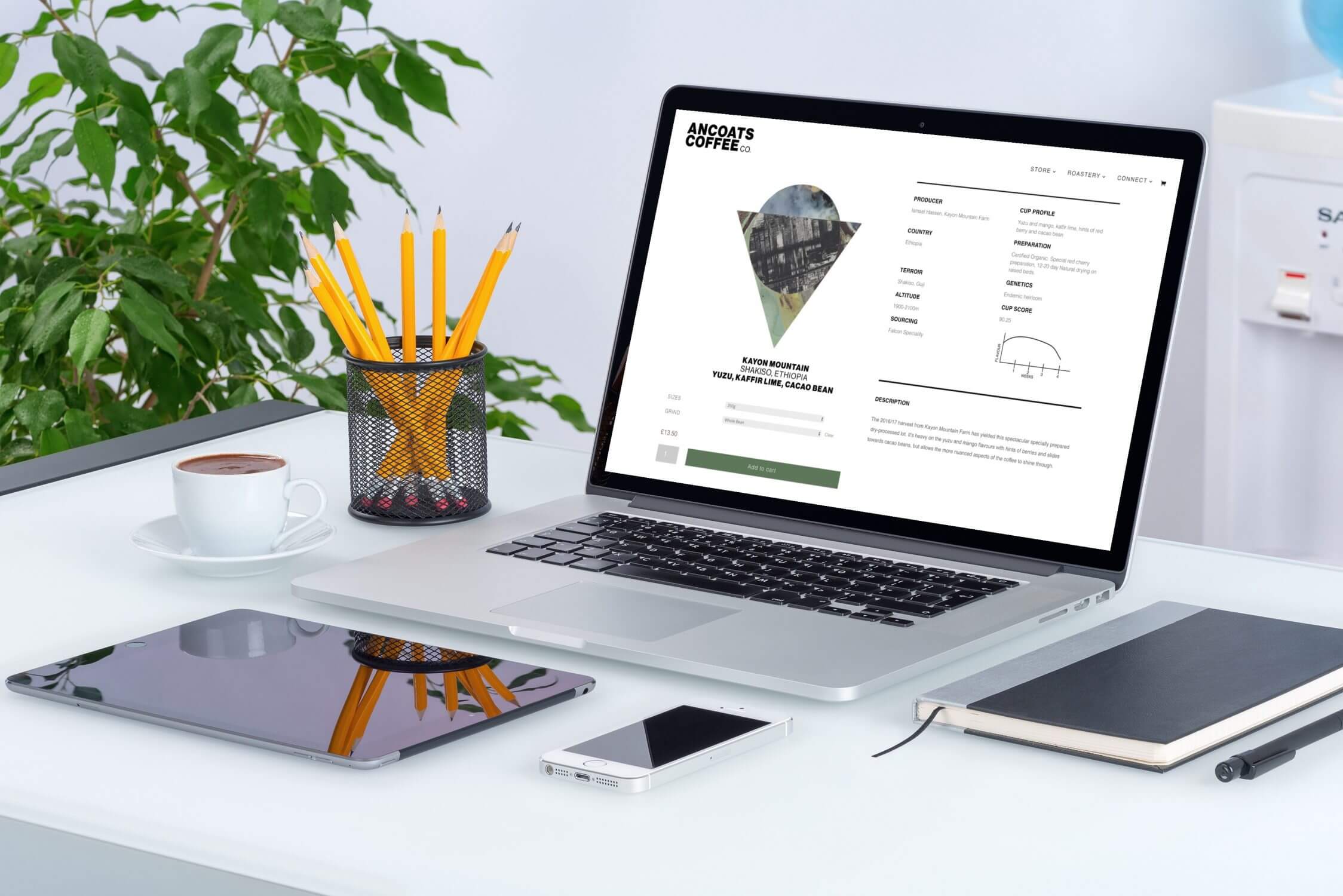
- Excellent performance across mobile, tablet and desktop
- Clear communication of key product info
- Promotion of 2 key products clearly differentiated by matching colours throughout the site
- Secure eCommerce features build into site
- Easy means for interested parties to find out more via FAQs and contact forms

