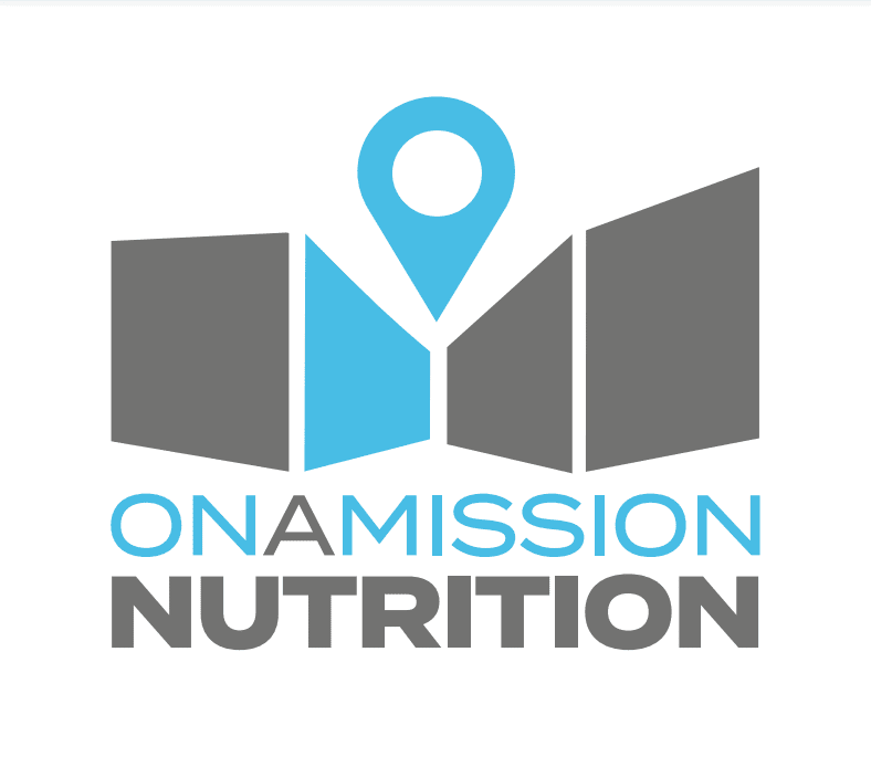
The challenge
We were approached by a startup nutrition and supplement retailer looking for help with their branding. The client had begun to set up an online shop and needed help creating a logo and brand identity to use across all their digital channels. As the designs were for a new brand rather than an established business, they needed to stand out whilst also demonstrating very clearly the nature of the business. For most people, this branding would be their first point of contact with the business, so it had to be great. Of course this would also carry through into their offline marketing in the long term.
Our initial conversations with the client began to give us an idea of what they were looking to achieve. They wanted to create a brand that was simple yet powerful, bold but minimal. This is always a good start as it’s the approach to branding that we suggest for almost all businesses. However, this means that every single aspect of the design must be very carefully considered. Key to this was taking into account the brand values of inclusivity. On A Mission Nutrition isn’t just for body building beefcakes, they offer a range of supplements for people who train at every level. From complete novices to experienced pros. We had to find something the would convey their considered and scientific approach to nutrition with a style that would still stand out to new athletes. Another key requirement was that the branding would have to be equally appropriate to both men and women. As more and more people of all backgrounds, genders and ages get into training, On A Mission Nutrition are keener to convey their approach to gender equality.
The solution
At Alloy, as you may know, we’re no strangers to the world of health and fitness. While we were excited to get started, we never skimp on our data driven approach and therefore first set about gathering information about possible competitors and similar brands. This information was collected, analysed and then discussed with the client. We were quickly able to identify the kind of designs they were drawn to and those which were not suitable. This helped define our initial direction and a small selection of typefaces which the client liked. We find this approach is a great way to give our clients a high degree of input into the design process. While non-designers may not be able to easily visualise all possible implications of design choices, such as icon selection, layout or colour scheme, even a complete laymen will naturally have opinions about existing branding which gives us valuable information on preferences.
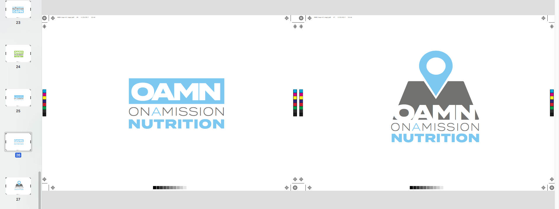
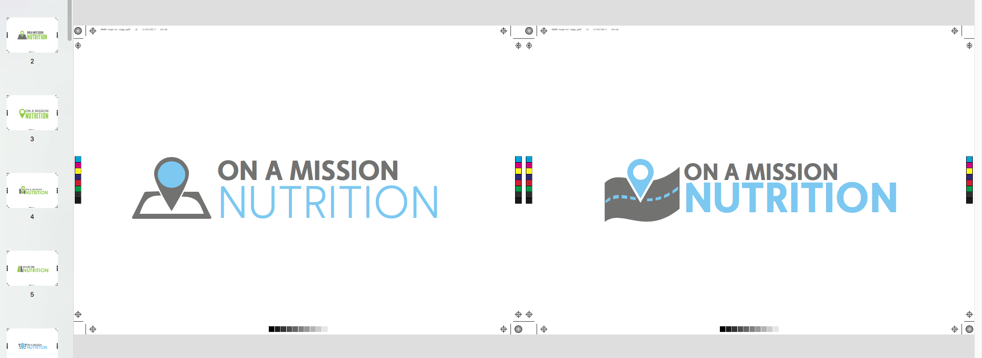
With the research complete and a good idea of where to get started, our designers got stuck in. Initially, 30 concepts were created. These drafts built on a couple of carefully selected colour palettes and experimented with typeface size, layout and possible logo and icon variations. These drafts were refined over three rounds of edits, during which time the client picked out a limited selection of their favourite designs. Eventually, with the final design agreed upon, our designers finished off the final master branding, which was then delivered in multiple formats suitable for print and digital use. The files were also provided in dimensions and resolutions perfect for use on social media to ensure that header images and profile pictures looked great on mobiles, desktops and tablets.
The details
- Competitor research to establish design trends in the nutrition ad supplement sector
- Existing branding discussed with client to create a detailed design brief
- Multiple rounds of drafts to refine each design element
- Digital files delivered all applicable formats including scalable vector, high res PDF, low file size jpeg, CMYK format for print and social media header art