The Challenge
An established and well known Indian restaurant – situated on The Strand in the heart of London – got in touch with us under new management. The business name was changing and there was a need to create a new and consistent brand identity. The new name for the business had already been selected and was chosen on the basis that it referred to the restaurant’s strong Indian heritage and classic approach to cuisine from the sub-continent. Being so centrally located meant that the business would have to stand out amongst both chain and independent restaurants nearby. We would have to make it immediately clear what the restaurant offered to all kinds of customers, from local business people to restaurant goers and tourists as well as discerning foodies.
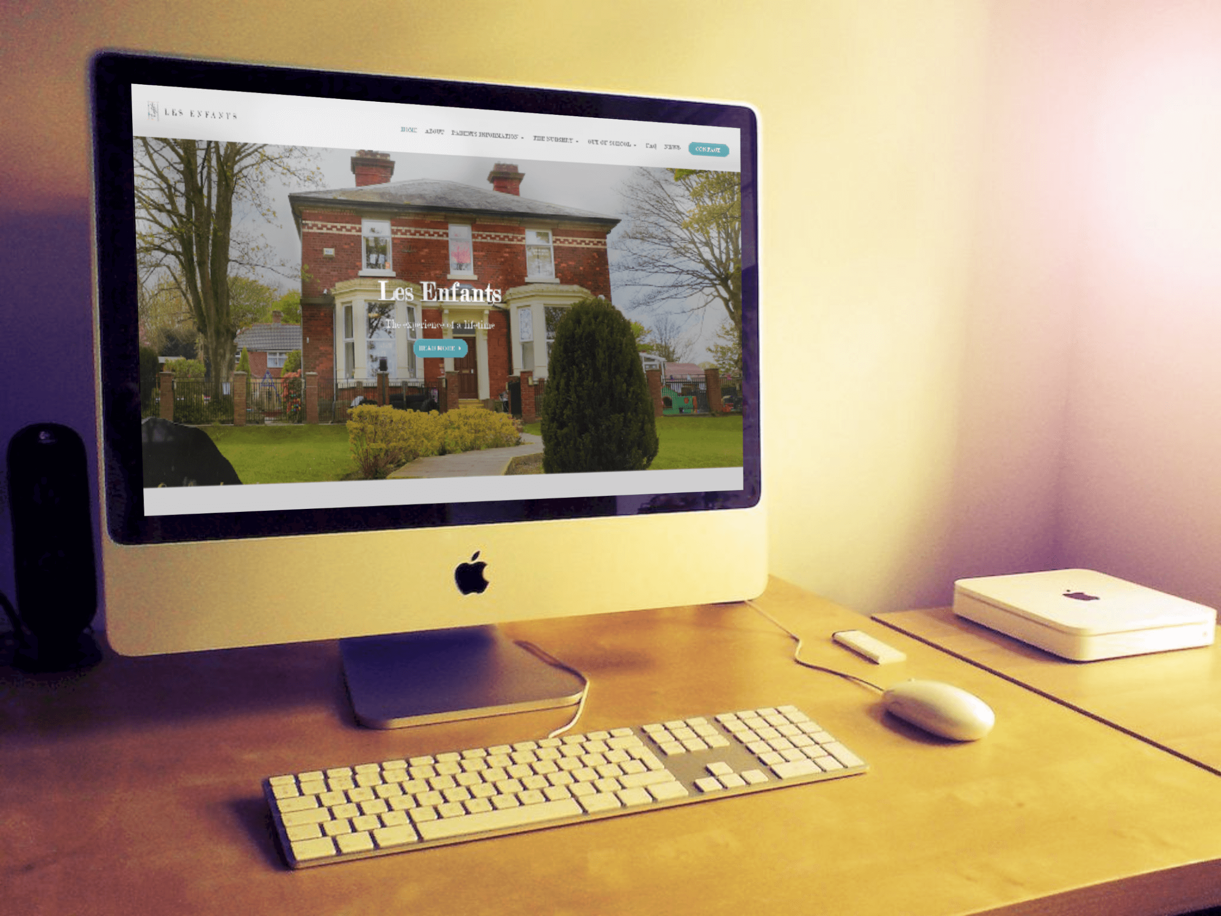
The styling would be modern and minimal but still convey the traditional approach to dining that the restaurant offered. As we would expect from a high class restaurant in London, the aim was to create a strong brand that could be carried through lots of uses. The new logo would form the basis for big signage out front, be carried into the interior in menus and also form the basis of the online presence in social media and a new website. All this had to be achieved within a tight time frame, enabling external contractors to create the new signage and then synchronise the launch of the rebranding which was due to take place on a tight deadline.
The Solution
To begin this project and refine the brief, we collaborated with the client to carry out in depth competitor analysis. Not only did this enable us to identify key logo design elements that the client like, but we were also able to rule out a number of styles and design option. At the beginning of a branding project, ruling things out is much easier than jumping straight to conclusions about exactly what will be in the final design. We often change the direction of the project substantially throughout the design process, however in this case we happened to find a design style early on which was then remarkably close to the finished design.

The Details
- Started competitor research and consultation carried out to refine the client’s brief
- 1 round of initial concepts created followed by 2 rounds of edits
- Created high resolution raster files as well as vector files
- New branding added to website and restaurant frontage

Our competitor analysis revealed that a modern serif font would be the way to go. In addition to this, we knew that the logo would include an icon that referred to a crown, a subtle reference to the business name meaning “Prince”. Our research identified an ancient design of coin associated with the business name, and giving us an indication of the style of crown to go for. This worked well as the design limitations of stamping a coin require the design to be quite bold and simple, an approach that we wanted to take to keep the logo design modern and easily identifiable.