The Challenge
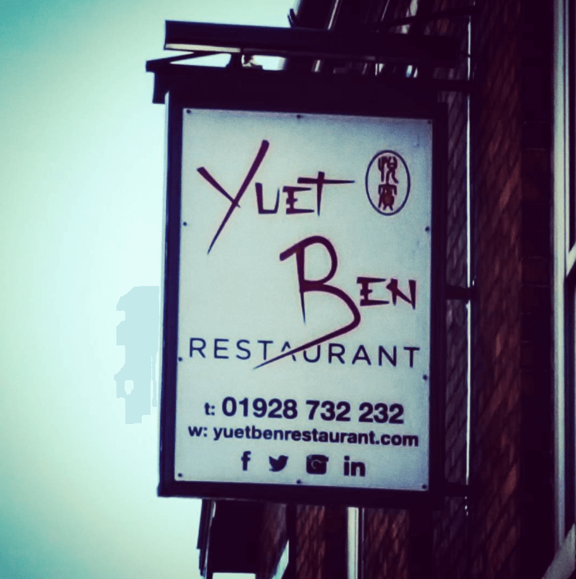
We were approached by an established, family run restaurant who were looking to update their branding. The managers of the restaurant were looking to make some significant changes to update the restaurant’s look and feel while keeping to the heritage of the business. While the interior remodelling was already under way, we had to rethink the logo that would be implemented in a number of different areas, becoming the basis for the signage out front, menus inside as well as being at the centre of online marketing.
The longer term logo of the business, since it’s opening some decades earlier, had been based on the Chinese character of the business name meaning “honoured guest”. There was a strong sentiment from this message which needed to be carried forwards, however the character itself was not easily understood by the restaurant’s predominantly English speaking customer base.
We quickly agreed with the client that it the top priority was to steer clear of the fonts and styles that have become cliched for cuisine from this part of the world. Despite this, we wanted there to be some consistency in the overall effect, the restaurant had many very long term customers who identified strongly with the brand and we didn’t want to alienate them, or imply that the restaurant was starting completely from scratch. At the same time, we would need to help move the brand forwards, making it clear to new and younger potential customers that the restaurant offered a high value product. We would have to marry a modern and minimal design with the traditional Chinese roots of the business and ensure that there was a visual continuity – all while keeping it clear what the business actually does.
To sum up this classic branding dilemma, the new logo had to be the same – only different.
The Solution
As with any branding or design project, we began with competitor research to explore the current trends in the client’s sector. The most useful reason for doing this is that it helps us rules out what the client doesn’t like. We found a number of very interesting examples which enabled us to rule out a lot of stylistic approaches. Once we’d identified a rough direction for the new logo we set about creating the concepts.
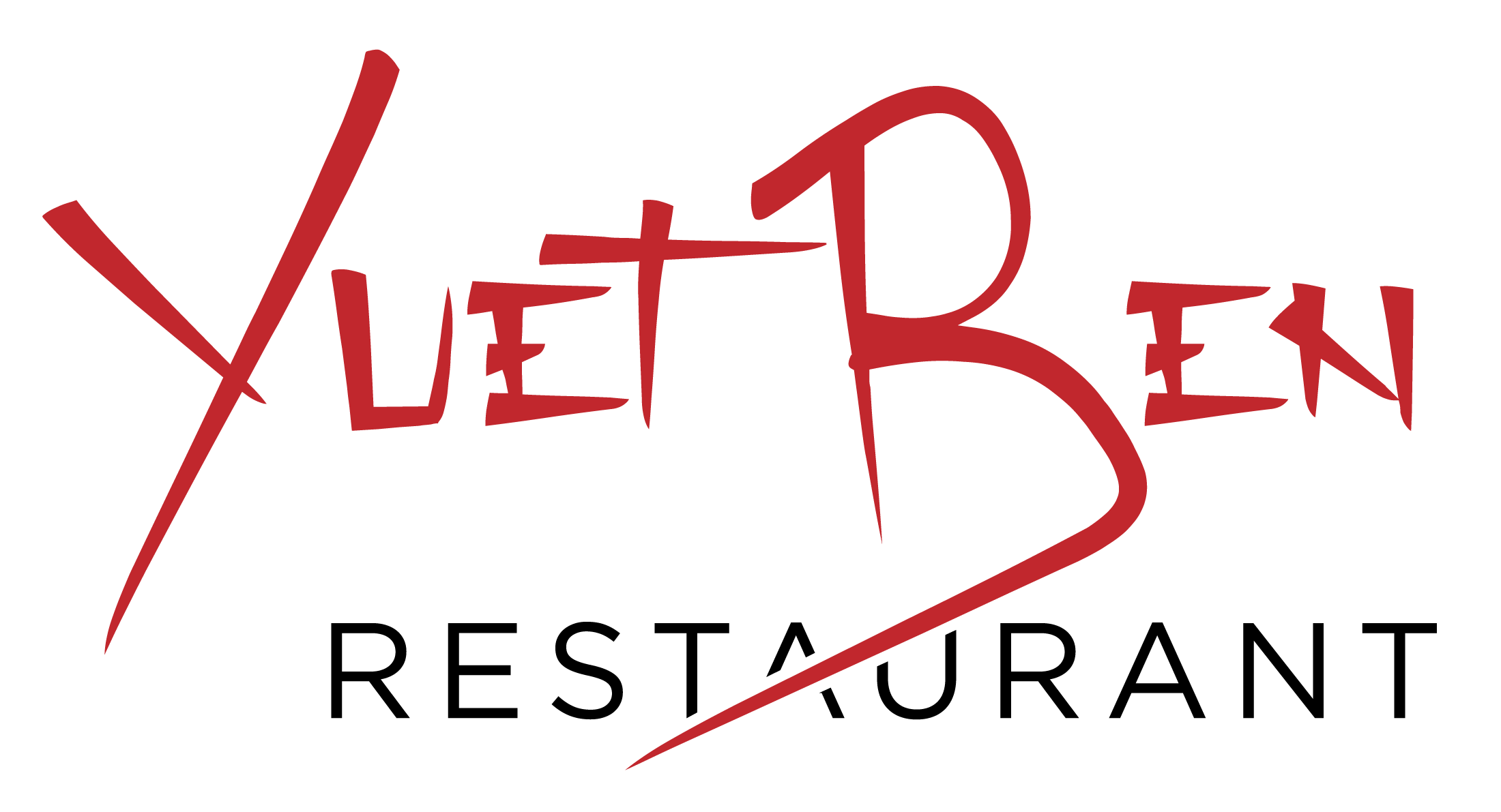
For this branding project, the choice of font would be the key decision. The difficulty was in finding something that was modern and legible but still harked back to the traditional heritage of the business without being too cliched. We considered hundreds of fonts in order to select a small number to take forwards in our initial round of concepts. In this case, we eventually decided not to base the logo around an icon, as anything that would be easily identifiable, such as a bowl and chopsticks would lead us in the direction of cliche. Instead, we made the choice of font the main focus, which meant that we could explore relatively stylised options, verging on complex calligraphy. Of course, the business name not being an English word meant that the lettering we went with would have to be very easy to read.
As we honed in on the right font and layout for the logo, we carried out multiple rounds of edits, presenting our suggestions to the client. This enabled us to refine further what they liked and what they didn’t like while we were able to give guidance on the real world ramifications of these design decisions. We made sure that the designs that were developed further were those with the potential to be easily recognised in a range of media, from front of house signage to social media icons.
Once we’d created the final design, we began to generate the different types of digital file that are always needed. Both raster and vector file types, with versions with transparent backgrounds were created for use in both digital and print designs. These are high resolution where needed and also enable the logo to be scaled to large sizes without losing sharpness.
Much more importantly, the client was incredibly pleased with the end result. They had been aware of the need for an update for quite some time however they had found the prospect daunting. In the end we were able to create a design that met their needs, keeping existing customers happy while making the restaurant more appealing to a newer and younger generation of patrons.
The Details
- Started competitor research and consultation carried out to refine the client’s brief.
- One round of initial concepts created followed by two rounds of edits.
- Created high resolution raster files as well as vector files.