The challenge
We were delighted to be asked to freshen up and refine the logo and branding of a leading independent gym in central London. The client had only recently set up their business but had already garnered praise from several high profile publications for their innovative approach to personal fitness. As a team, we’re absolutely passionate about our own training, so the chance to use our knowledge to refine the image of this exciting and innovate gym was something we relished.
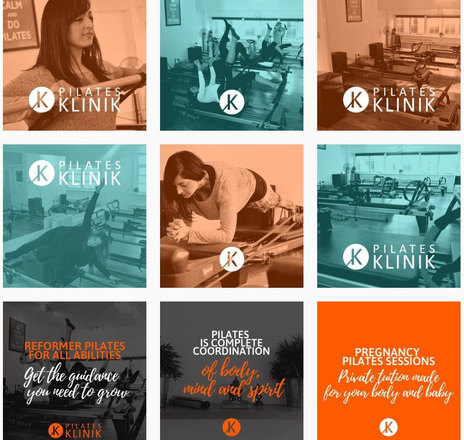
The existing logo wasn’t bad, but recent design trends had seen many businesses in this space leaving behind classic skeumorphic branding and moving towards cleaner and flatter designs widely considered to be more modern. The refined branding we were to create would need to look great across company t-shirts, printed flyers and signage, as well as the company website and social media channels. We needed to bear in mind that the designs must print well, with colours that pop and clean, precise lines. The client was keen to quickly roll out their updated branding in an upcoming print campaign.

The Solution
We approached the updated branding much as a personal trainer might approach working with a new client. We took some time to learn about the company, their existing image and the kind of clients they most often work with. Armed with a full understanding of the identity and USPs of the gym, we set about creating a huge range of ideas based on an evolution of their current logo and branding.
Our ideas played around with the font sizes and spacing of the existing logo, did away with skeumorphic textured elements and brought greater focus to the simple colour palette. Skeumophism refers to the practise of imitating real world textures in the digital domain, for example a note taking app designed to resemble a notebook. The antithesis of this, flat ‘material’ design is generally considered to be more legible and more effective at converting visitors.
With the drafts completed and assembled into an easy to digest PDF, we delivered our ideas to the client. The client was delighted with our work and picked out their favourite logo from the designs we had created. The design was then fully rendered and adapted for best display across social profile images and print. The new branding looked great and was ready for a complete rollout across all digital channels as well as the company’s new flyers.
The details
- Previous skeumorphic designs elements removed.
- Flat, modern design language adopted.
- Fully scalable vector graphics used for pixel-perfect reproduction across desktop, mobile and print.
- Range of ideas and variations delivered to client.
- New branding delivered in all appropriate formats and sent to print on stunning new flyer.
- Delivered in all correct formats including high res PDF, transparent PNG and layered files.