The Challenge
We were approached by a highly qualified and experienced personal trainer who wanted to expand his offering of specialist fitness classes. He had a brand name and logo, and after some discussion, decided that it did not sufficiently convey what he offered, or why it was of value. His expertise gave him the ability to achieve much better progress for his clients than simply turning up to the gym or going to a standard group class would get. From the start, the whole Alloy team got stuck in to learning as much as possible about what they offered, with our personal enthusiasm for specialist sports training coming to the fore.
Our understanding of the techniques used and their physiological impact, was invaluable in identifying and conveying the value of these classes to the relevant demographic. London has a highly competitive sports and fitness market, but our industry analysis found a gap. Our client offered small classes that provided support of a personal trainer but without the price tag of one-to-one sessions. We also found that his expertise meant he was uniquely positioned to get great results for almost anyone, especially those who have not done high level training before. So we had to create a brand that could appeal to complete novices, regardless of age, gender or sport of interest.
The Solution
Once we had distilled the scientific reasons that his classes were so effective, we had to try and convey this message as simply as possible. First, we worked on the brand name. We wanted to find something that was short, punchy and started to explain what the business did. We considered a ton of different formats and created loads of possible names. After several rounds of discussions with the clients, we honed the language towards something that would work. Before moving to the final stage, we carried out research into the availability of domain names and possible industry overlap.
“It is and has been a pleasure working with you and I hope we can continue to do so. You really helped bring my idea of a website to fruition by advising and creating parts I hadn’t even thought of such as a logo and social media. You made the process fun and professional. I look forward to continuing to work with you and I would recommend your services to anyone.”
– Flow Fit
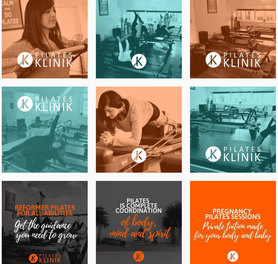
The final results was chosen by the client on our recommendation that it would be easily identifiable and convey the brand values. It’s also a name that will stay relevant to the company as it grows in it’s offerings. Moving forward to the logo design, we quickly settled on a colour scheme that was gender neutral while being vibrant and energetic. A vivd orange was balanced by a more muted grey, an equilibrium that is most appropriate for a trainer who draws heavily on gymnastic, bodyweight exercises. The fonts we used were simple and bold with a slight italicisation indicating movement.
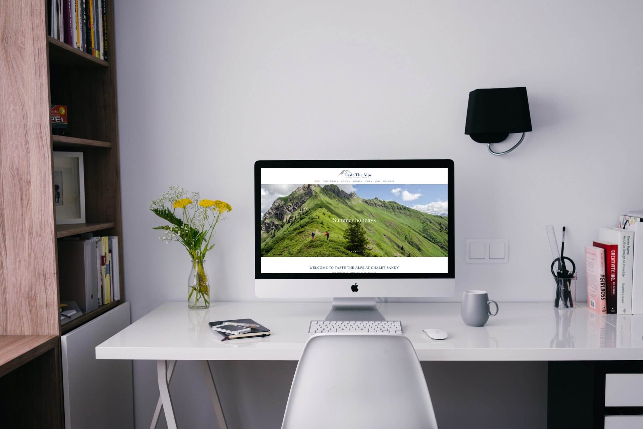
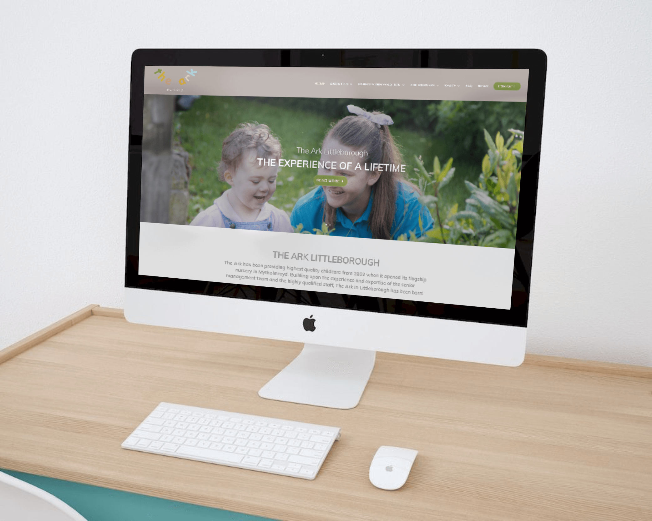
We opted to include a tag line and icon in this particular logo to help convey the purpose of the business. The tagline simply mentioning the two key service offerings, using language that is easily understandable to non specialists, but used here in a novel arrangement to convey the companies unique services. The running person icon further reinforces the purpose of the business. This branding project was carried out as the first step of a multi platform marketing campaign. Having identified a strong domain name for the client, we proceeded quickly onto a web design project and securing social media handles for a number of pages that we also designed.
The Details
- Assessment of brand and key messages
- Brand name ideas drawn up
- Logo designs drafted
- Consistent colour palette across the website, social channels and imagery
- Mobile and tablet friendly designs finalised
- New branding implemented across all channels