The Challenge
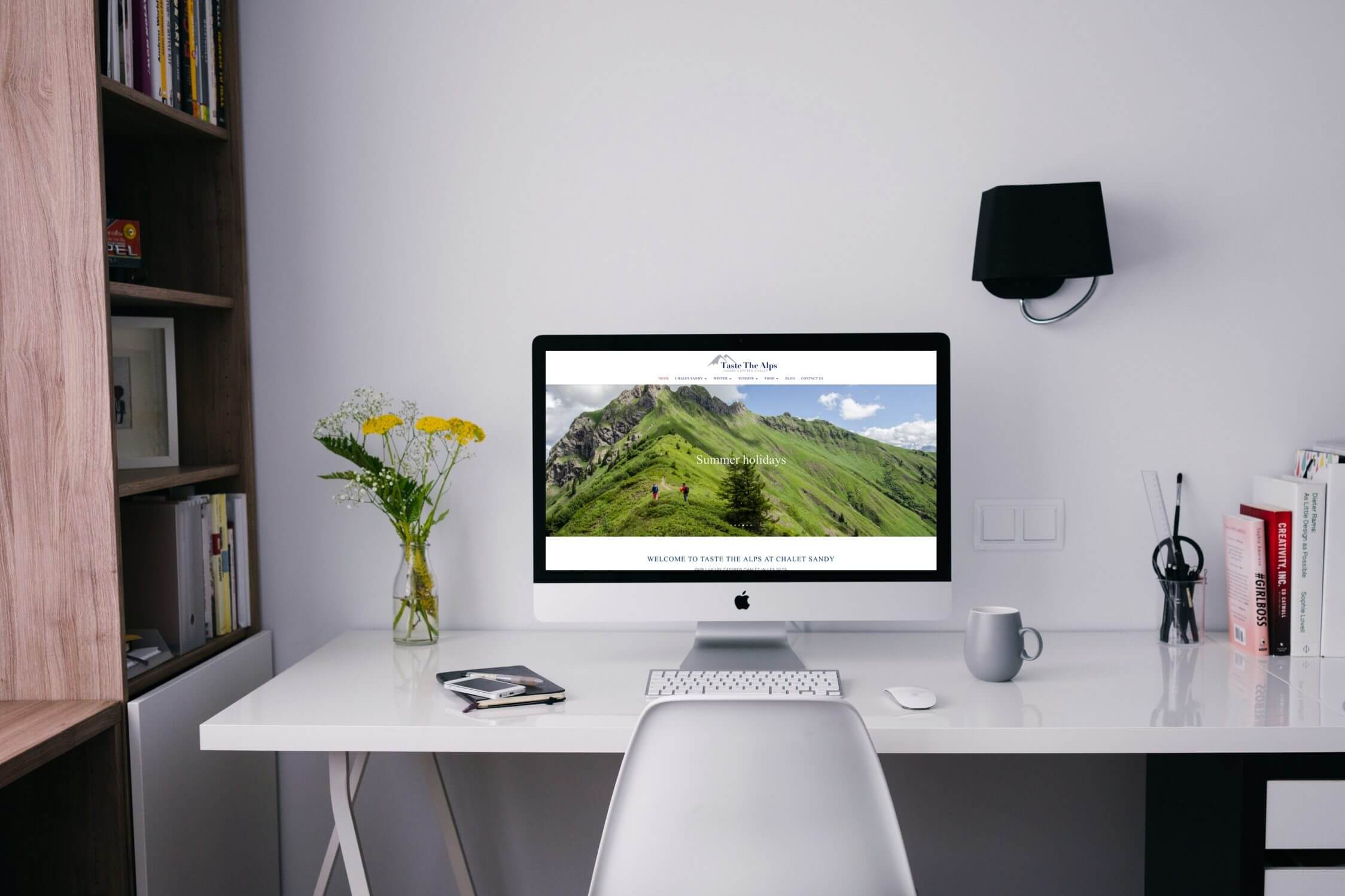
We were approached by a small company that refurbishes and manages luxury properties in Chamonix, right in the heart of the French alps. Operating in an area with an incredibly high density of properties with overseas owners they needed a website to expand their client base. Such property owners are often low on time and have very high expectations. Our client has an unparalleled capability to exceed those expectations. With absolutely stunning properties in their portfolio, we had the task of conveying the fantastic skills, services and results that our client provides. This would begin with a radical new web design to promote the full range of services that they offer.
As is often the case with small, high value businesses, our client is incredibly flexible in how they can work with their clients. This naturally presents a challenge in how to convey this level of dynamic service. To (slightly) exagerate, the answer to the question “what do you do for you customers” is normally “anything”. So before we started, we had to track down the range of services that they offered, the limits of those services and why they were of such a high value to their customers.
As is often the case, our client was incredibly busy with the day to day running of their business. This throws up the usual challenge of how to keep in close contact. It takes time to gain an understanding of a new client’s tone but our experience working with a range of small businesses ourselves mean we can extract a log of information in short time.
The goal of this new website would be to attract new clients in the Chamonix valley, a thriving property market with a growing demand. The majority of these clients are English speaking property owners, many of whom require renovation and then maintenance work carried out on a second home. While our client had a website that had been in place for some time, they had since updated their logo. Much of their work was gained from word of mouth and their website did not sufficiently convey the incredibly high quality of their work. With many of their clients based overseas, it was of course essential that the website make a strong first impression and promote their high value work.
From a technical perspective the website also needed to be updated to make it compatible with mobile devices and more modern screen sizes. A common issue we see is that the images from a website that was built a few years ago simply arent up to scratch on the majority of computer or even mobile devices which are thousands of pixels across. With the business situation in one of the most stunning locations in Europe, we needed to make sure that the new site would do the stunning location justice.
The Solution
Before we began work on the website, we had to build a comprehensive picture of what our client did. Their previous website hinted at the range of services that they could provide, but as “property management” is such a broad term we needed to find out the specifics of what they could and couldn’t do.
The first part of our onboarding process was to develop an updated structure for the new website in partnership with the client. Not only did this set the context for our understanding of the business but began to establish the navigation system that needed to be created.
The client appreciated the value of investing their time in providing us with very in depth information as to what they offered. In order to make the best possible use of our clients time we carried out a range of industry research and competitor analysis, we were then able to provide a succinct analysis of what their customers would be expecting. From such a strongly briefed position we were able to guide our client in what information we would need to take things further. This sort of close conversation is very normal at the start of a big project as our understanding of marketing gels with the client’s understanding of their customers.
In order to keep costs down the client provided the bulk of the copy for the website. We then digested this in order to create the high impact copy for the homepage that would introduce the company. We normally find that the short snappy sentences that feature front and centre on the website are the hardest bits of writing to do. To be able to sum up the value of a company in just a few words, that will have a high impact on the intended target market requires a very in depth understanding of what the company does. The level of collaboration we achieved with the client enabled us to generate some really stand out hero texts which when partnered with the jaw-dropping photos of their work created a pretty awesome effect.
Once the text and images were ready to go we started planning out the design and layout of the website. Inspired by their new logo, which featured a modern font and a flat, styled icon, we started selecting a colour palette for the site. This is the sort of approach we often take as we find that flat, modern, material design achieves a strong visual impact while enhancing usability. It’s the approach that Google goes for in their design, and it’s the intention behind most cutting edge web design these days. While we had a lot of creative freedom on this project we still kept the client in the loop. Seemingly small decisions, like font selection can have wide ranging ramifications. Establishing a strong brand identity in a website needs to not only create the right perception in visitors, but also needs to be carried through into offline branding. Consistency is key and we were careful to check what the possible effects of our decisions could be.
As is often the case in our work, we found that less was indeed more. We let the pictures do the talking. With plenty of white space (which in this particular case was actually mostly white) we placed text and images in a way that would draw attention to the incredibly high standard of work that our client carries out. Naturally, we were careful to make sure that the accompanying text provided the context that visitors would need in order to navigate to the part of the site that would best meet their needs. Great photos do not, by themselves, convey exactly what a business does. Even in the cases of ubiquitous brands a little more information is needed to direct one’s attention towards the specific product or USP being advertised. Ultimately, we were able to keep the website as simple as possible to create a dramatic effect. Which is not as easy as you might think. Small tweaks here and there can make all the difference between a site the looks “meh” and a site that looks “WOW!”.
Of course we do much more than make sites that look pretty. For this client we implemented some clever strategies to give them the best possible start for SEO progress. Not only was the copy and each page designed with search engine optimisation in mind from the start, we incorporated a few neat little tricks to keep the pages navigable while still including as much written copy as possible. For example, we added FAQs with hidden concertina answers on relevant service pages, to increase conversion while stopping the page from taking an age to scroll down.
As usual making the website a dream to use on mobile devices was no afterthought. With the majority of online traffic now being from smart phones and tablets of some description, we had to carry the responsive design across in a range of screen sizes. There are of course a few challenges in building a website that looks great when radically rearranged for different sized screens. However, our experienced team and advanced design tools mean we can get the site looking slick in all situations. There are loads of factors to take into account when doing this, from the fact that Google indexes mobile first to the loading speed of each page. As an all round digital marketing agency you can be sure that we will take into account the long term marketing impact of everything we do.
The Details
- Implemented an updated company branding in a an all new, high impact website design
- Worked closely with the client, identifying how best to convey company USPs and creating original copy
- Created an original design and menu structure to enhance user experience and optimise for conversion

