The Challenge
We met with the leader of a large community care organisation from London. The business was long established and had grown to provide a wide range of services within the health and social care sphere while having also branched out into providing a number of training certifications and apprenticeships. The task was to completely rebrand the company for the 21st century and streamline their online and physical messaging with clear, modern design language. What made this project particularly challenging was that the logo had to convey the professionalism and value that the client brought when providing training to large businesses, while at the same time maintaining a much more human and empathic effect for use in the healthcare sector. While these two sectors would normally draw on rather different approaches in order to meet these separate goals, we had to create a single brand identity that could be used in all situations.
The Solution
After much discussion with the client, we came to terms with the fact that it was not going to be possible to simply give the previous logo a “refresh”. This meant starting again, almost from scratch. Much thought was put into how to best convey the value of the organisation and their profoundly strong values of diversity and support. Having been provided with a few basic concepts from their team, we were able to get ideas from a number of people in the organisation who had experience working within different arms of the business. It was essential that we get the thoughts of people representing the company in different industries so that they could get behind the new logo.
Any rebranding, let along one of this scale, should always have a lot of thought out into it. While a logo may seem a small, quick fix, the potential ramifications are big. Not only in terms of the impact that it will have on potential future customers, but also regarding implementation. If you decide to change up the branding again in the near future, a huge amount of cost can be caused from changing all digital iterations of the logo, as well as potentially having to create new uniforms, banners, stationary and a whole host of branded materials in the real world.
In order to establish the direction of the new logo we explore a huge range of options for the key components of the branding. This began with identifying an icon that could be used to represent the humanistic approach of the organisation. While many “person” type icons are available, the appropriateness of them were rather varied. Once we’d picked out the key style to go for, much more tweaking and refinement was carried out to finalise the icon. The icon selection process was carried out in partnership with the font selection process and it is the combination of both the icon and the font that will create the all important brand impact.
Frequent feedback from the client enabled us to hone in on the right design, with our experience of branding guiding the creation of a completely original brand identity that was able to reflect the modern, professional approach of this dedicated team.
The Details
- Logo redesign and implementation across all channels
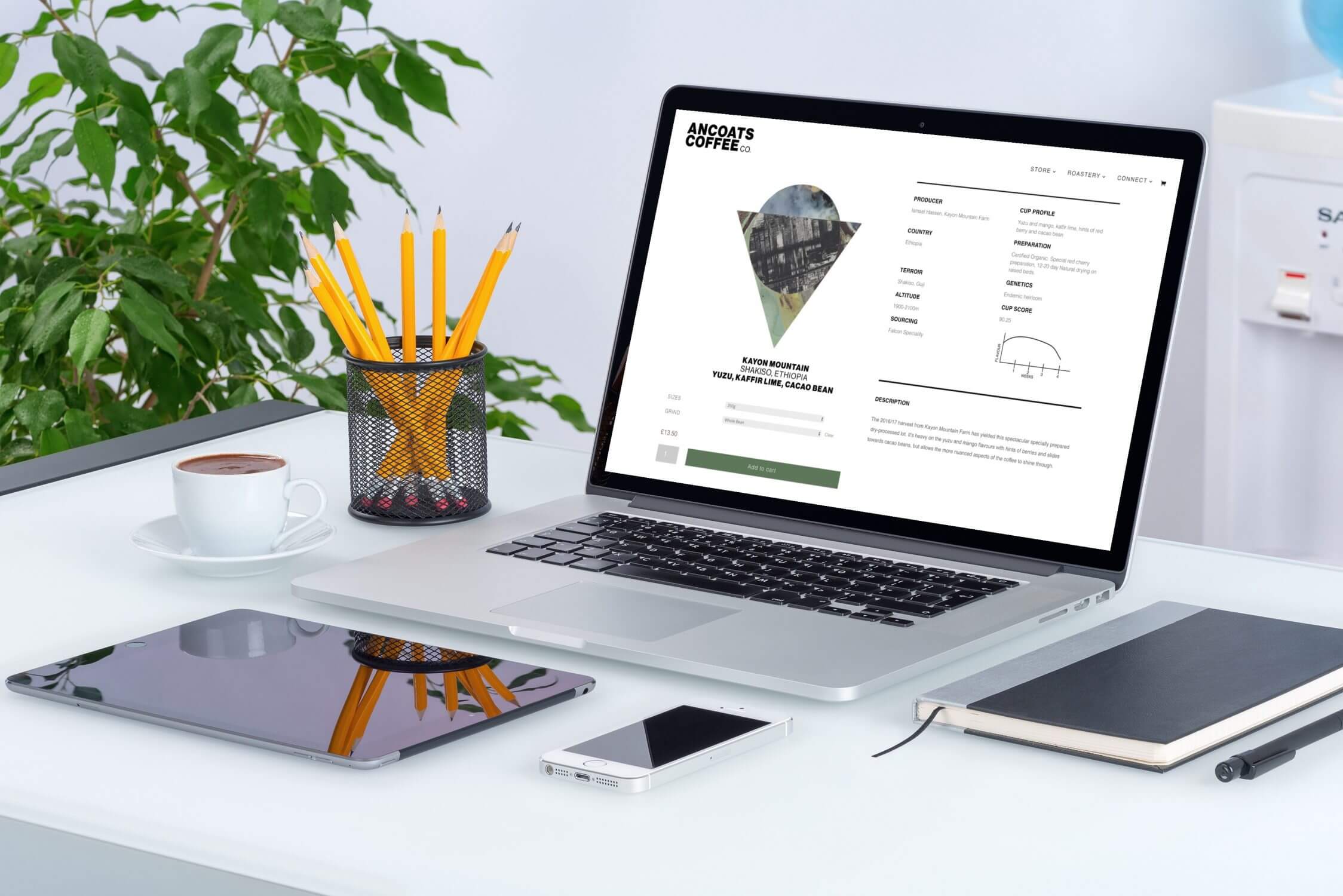
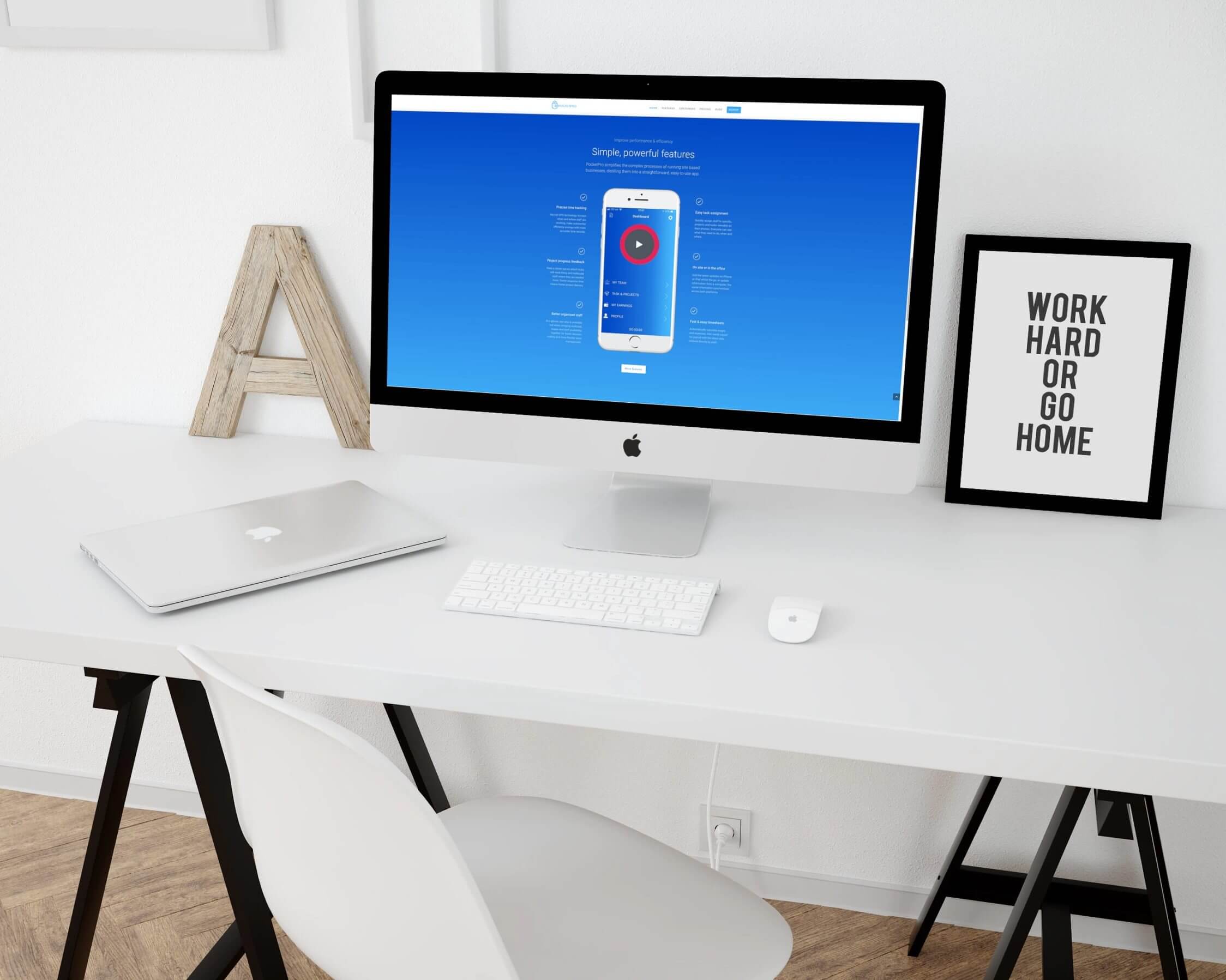
- Website information distilled and optimised for modern web browsers
- Mobile and tablet friendly design built into each page (no redirects to other pages for mobile; much better for SEO)
- jQuery galleries (No flash) animations for maximum compatibility with iOS devices
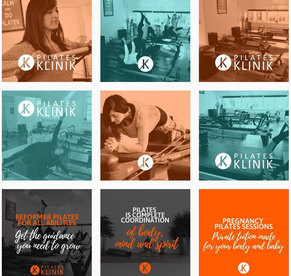
- Service pages built to clearly separate and inform users of the different sides of the business
- Premium UK cloud website hosting with 1 minute uptime monitoring