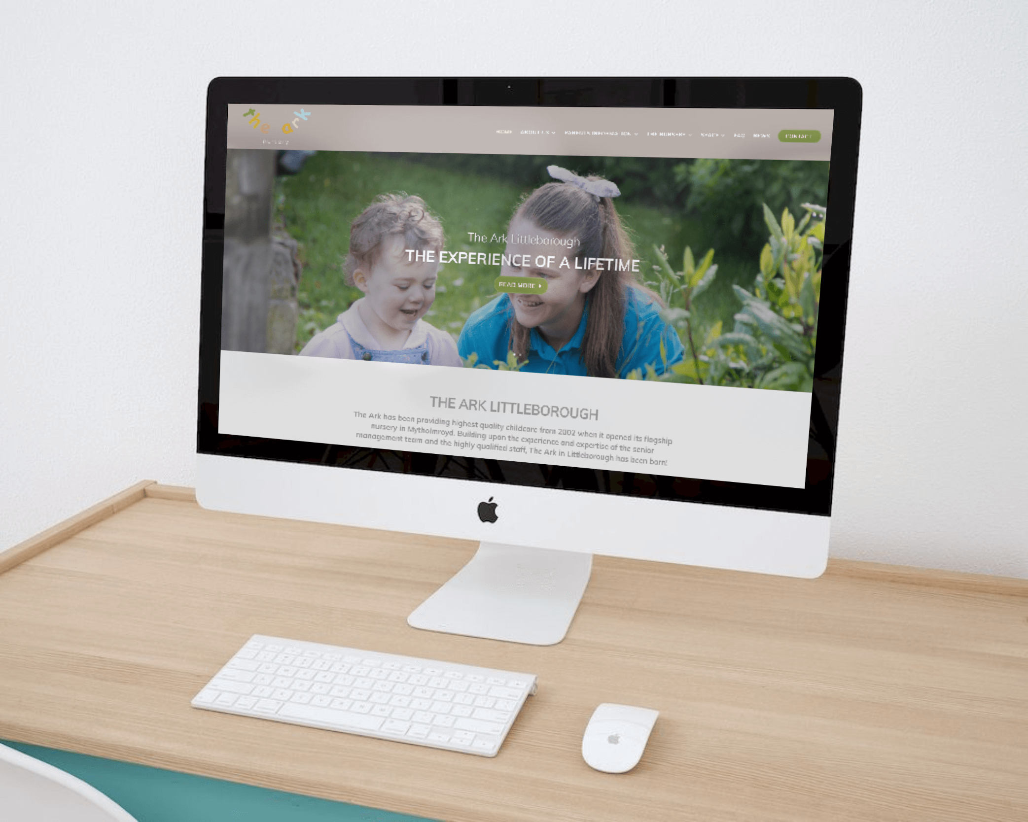
The Challenge
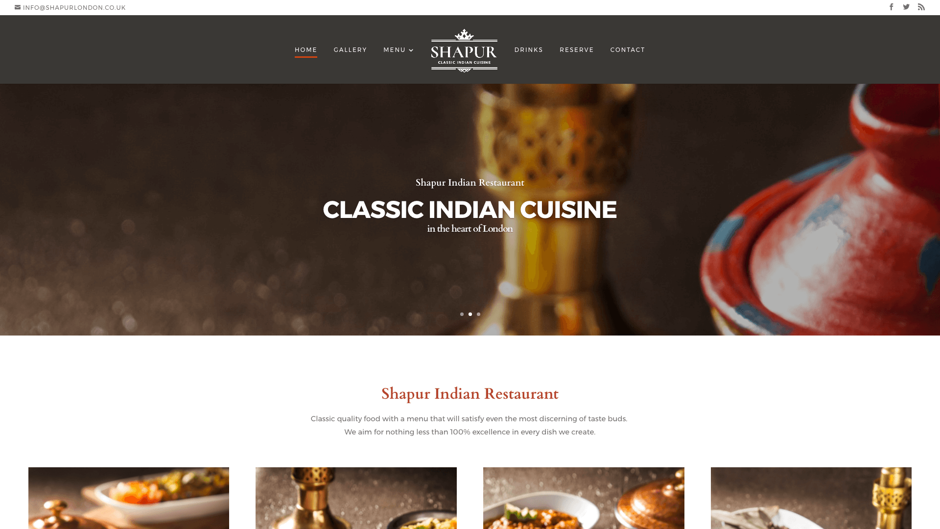
We were approached by an Indian restaurant who wanted to freshen up their digital presence with a rebrand and facelift across their entire site. Their previous website had become dated and was in dire need of modernisation. New graphics, photographs and content were needed, as well as a responsive design that supports today’s mobile browsing standards.
The Solution
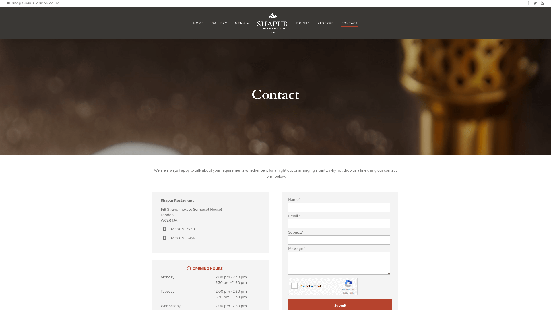
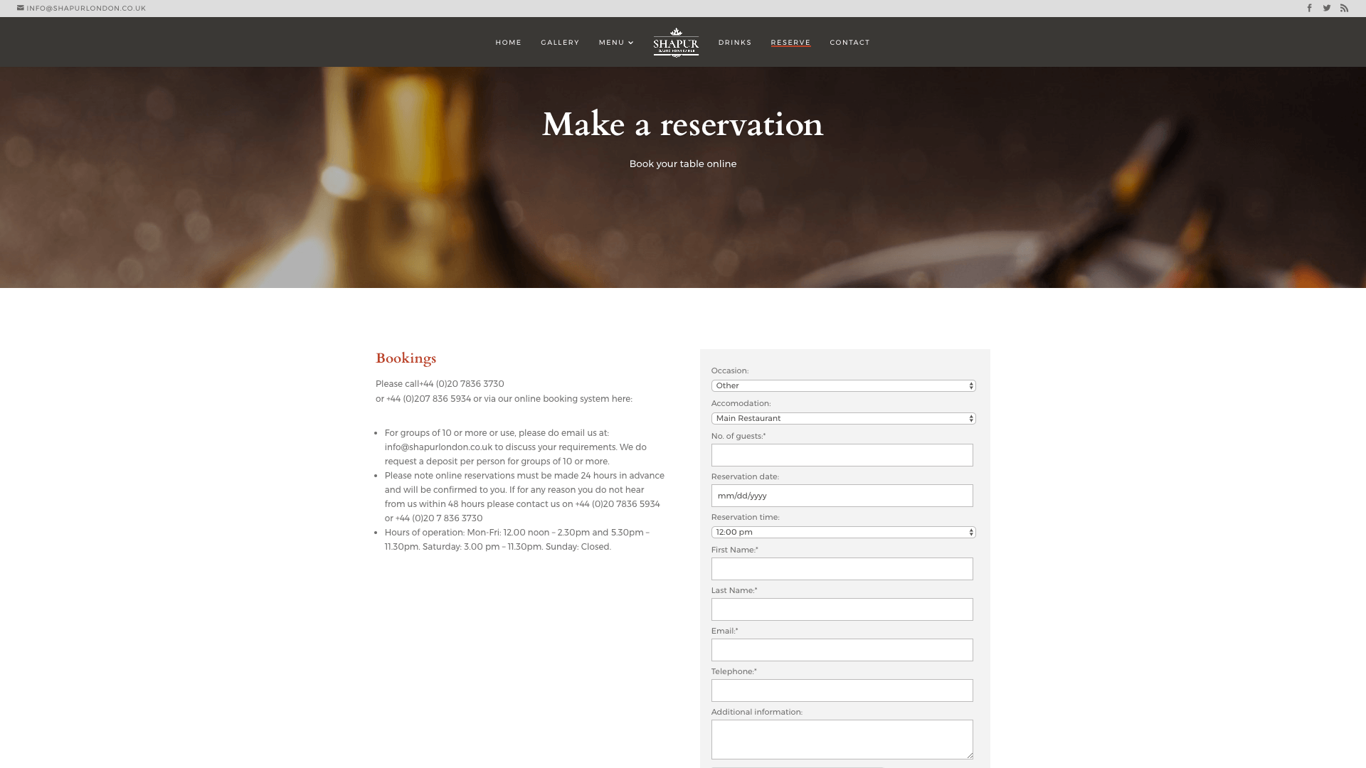
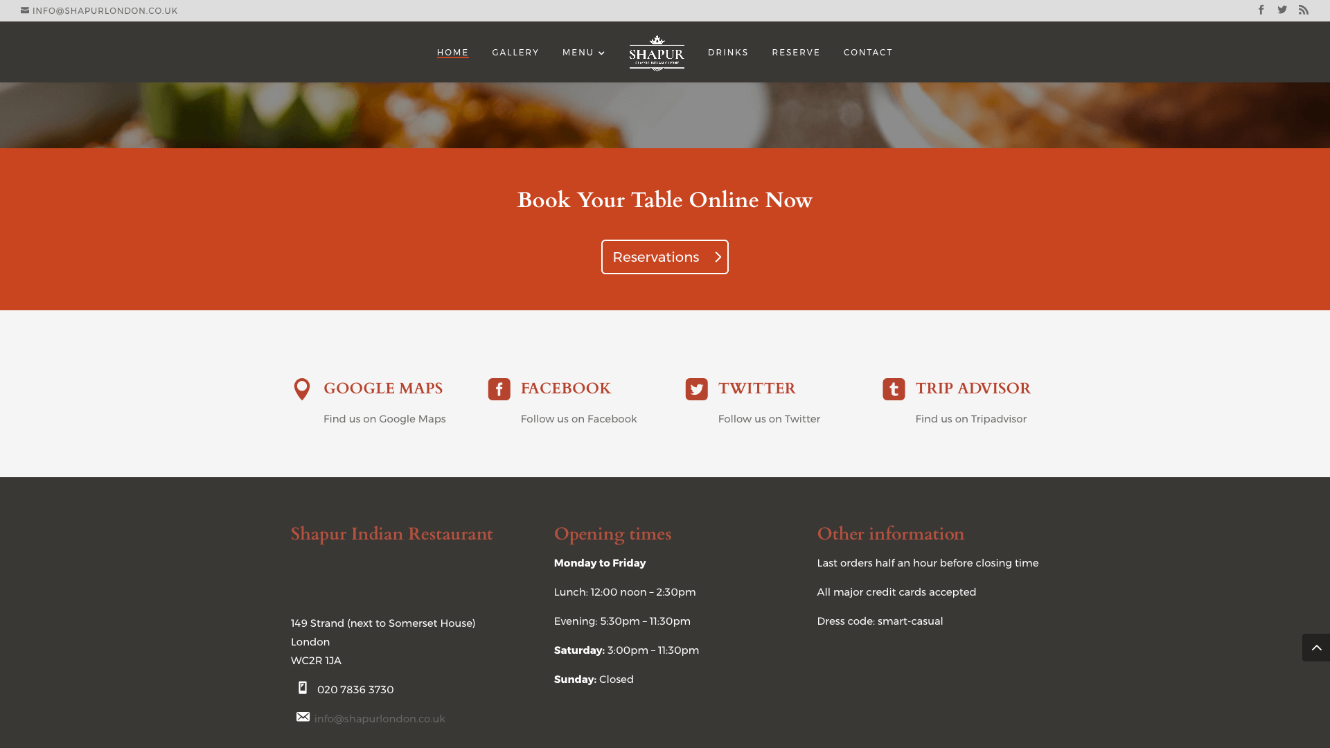
Just take a look at the gallery below to see the difference the new design made, it’s night and day. The website was rebuilt in its entirety on a new platform. The new platform was faster loading and more secure than before, ticking key boxes in terms of SEO and offering a far superior user experience. Top quality photographs were taken by an experienced photographer to showcase the restaurant’s high quality cuisine. The new images created stunning site-wide visuals, offering an engaging introduction to the food on offer.
The new site offered improved social media integration, online bookings and built in contact functionality with appropriate schema markup. This approach ensured the best possible local SEO performance to allow customers in the area to locate the restaurant as easily as possible.
A simple and effective colour palette was chosen for the site. The black, white and red palette complimented many of the colours in the photographs used on the site. The effect was a relaxed and pleasant browsing experience, in contrast to the somewhat busy visuals of the previous site.
The original site’s dated navigation system was rebuilt with a persistent navigation bar which follows a visitor’s scroll behaviour around the site. The improved navigation means that wherever a visitor is on the site, they can quickly and easily navigate to the booking, contact and other pages. This is particularly helpful on a website such as this because the food and drink menus contain many items and the persistent navigation bar avoids users needing to scroll to the top of bottom of the page to jump to a different section, a far superior user experience to the previous design.
The Details
- Site rebuilt on mobile-friendly, responsive platform.
- Visual redesign in flat, modern style
- Built in booking system and contact functionality
- High quality photographs throughout
- Persistent menu bar and brand visuals
- Consistent colour scheme across the site
- Social media integration