“I’m building a new website. Do I need to update my branding too?”
Answer: Probably
When we start putting together a plan to build a new website for a client, an often overlooked part of the project is the logo and branding. While many people are perfectly happy with their logo, when it gets dropped into a brand new, shiny website, there’s nowhere to hide. Maybe an established brand looks great on uniforms and letter heads, but this doesn’t mean it will have the same impact online.
Consistency is key
The whole point of branding is that people can recognise your business. If your logo isn’t the same every time someone sees it, this can be tricky. It’s often taken for granted that big businesses achieve consistent branding, with exactly the same shade or brand colours popping up in all places, online and in the real world. The reasons they go to such lengths to achieve this are hardly new. Since the times of medieval warfare, people have expressed their allegiance with colours and symbols. Branding for businesses is still pretty much the same today.
When a new website is called for, it provides an opportunity for someone with a fresh pair of eyes to look things over. Often, one of our designers will start picking up on the many little things that may have slipped through the net due to the daily challenges of running a business. Maybe the uniforms are a slightly different shade, or a slightly off brand font has been used in couple of designs. If a logo needs to be updated in order to bring it in line with a modern web design, this provides an opportunity to make sure the rest of your company’s branding is all on the same page.
A quick test
A simple place to start is to click through from your website to your social media pages. If it’s been some time since you last checked up on them, you may want to think about a little update. Even if a visitor to your website does not have the eye of an experienced designer, clicking through from a modern, minimal website to a Facebook page that’s three years old is going to get noticed and it’s not going to look good.
Modern logos for modern purposes
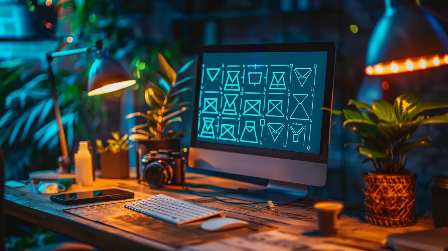
Fashions change. This is as true in logo design as it is in many other walks of life. Without wanting to start falling into abstract design theory, times have changed. What we see more and more of these days are simple, modern “flat” material designs. This simply means a simple bold colour scheme with no textures. This is the result of the prevailing style in web design which follows the same rules as outlined by Google’s Material Design philosophy (https://material.io/guidelines/#introduction-principles). The whole point of this is to achieve consistency in appearance and interaction across all kinds of digital devices. A logo and website have to look good and similar in style on both a tiny mobile phone as well as a desktop and a massive TV. There are number of reasons, both technical and design based, that mean that this simple and minimal aesthetic is the design direction of almost every type of business.
Less is more. But more means more.
Another design cliche, but it’s still true. Unfortunately achieving more through less is not as easy as it sounds. We’ve lost count of the number of times when we’ve been told to just give a logo a “quick refresh”. The second you start, you’re faced with a lot of decisions. From font selection and letter spacing, to colour swatches and how to match every single existing version of the logo. Each small decision can have a big impact on the overall design, so when you work out every possible combination of these variables, there’s a lot to think about.
But first; branding.
While a logo may be small and not something you pay much attention to each day, it may give a potential customer their first impression of your business. Making a good first impression therefore really matters. Once you’ve started it’s hard to go back. If you decide to change your logo later down the line, it’s going to be a pain. Whether it’s a tweak to the shade of a colour, or using a slightly different icon, it could mean changing the website, digital and printed designs, uniforms, even repainting the walls of your work space, so it’s much easier if you get it right first time.
That’s why we start with branding. But everyones’ situation is different. Get in touch for some serious advice on your own branding and web design situation.