The fitness industry is growing faster than ever before. We think this is a good thing.
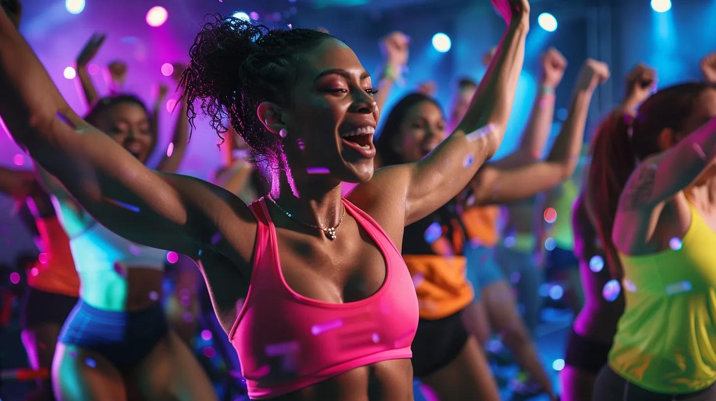
More fitness, training, nutrition and health businesses are becoming mainstream and more accessible than ever. You can get protein powder at your local Tescos, there’s a crossfit box in every city and (almost) every man and his dog can now be found practising yoga in the park on a Saturday afternoon. There are wide reaching implications of this, but here we’re going to take a quick look at how broader trends in the fitness industry are impacting branding.
Less tribal, more accessible
The key one for us is the shift towards making different types of training accessible to a broader number of people. Girls can lift, guys can do spin classes and HIIT is for everyone. So instead of super aggressive bodybuilding gyms and flowery, feminine wellbeing brands, many businesses are moving more towards the centre.
We’re seeing this affecting branding in a number of ways. Gyms are seemingly less likely to opt for the somewhat cliched red and black power colour scheme with a cartoonish bicep or barbell. There’s a growing recognition that this approach is simply not going to resonate with a very wide audience. Sure, Gold’s Gym might not change their logo any time soon, but it looks old fashioned enough that it could comfortably be called a “heritage” brand, the exception rather than the rule. Individual colours may not be definitively gender specific, but when combined with a business name, font and logo, the overall effect can quickly become too gendered.
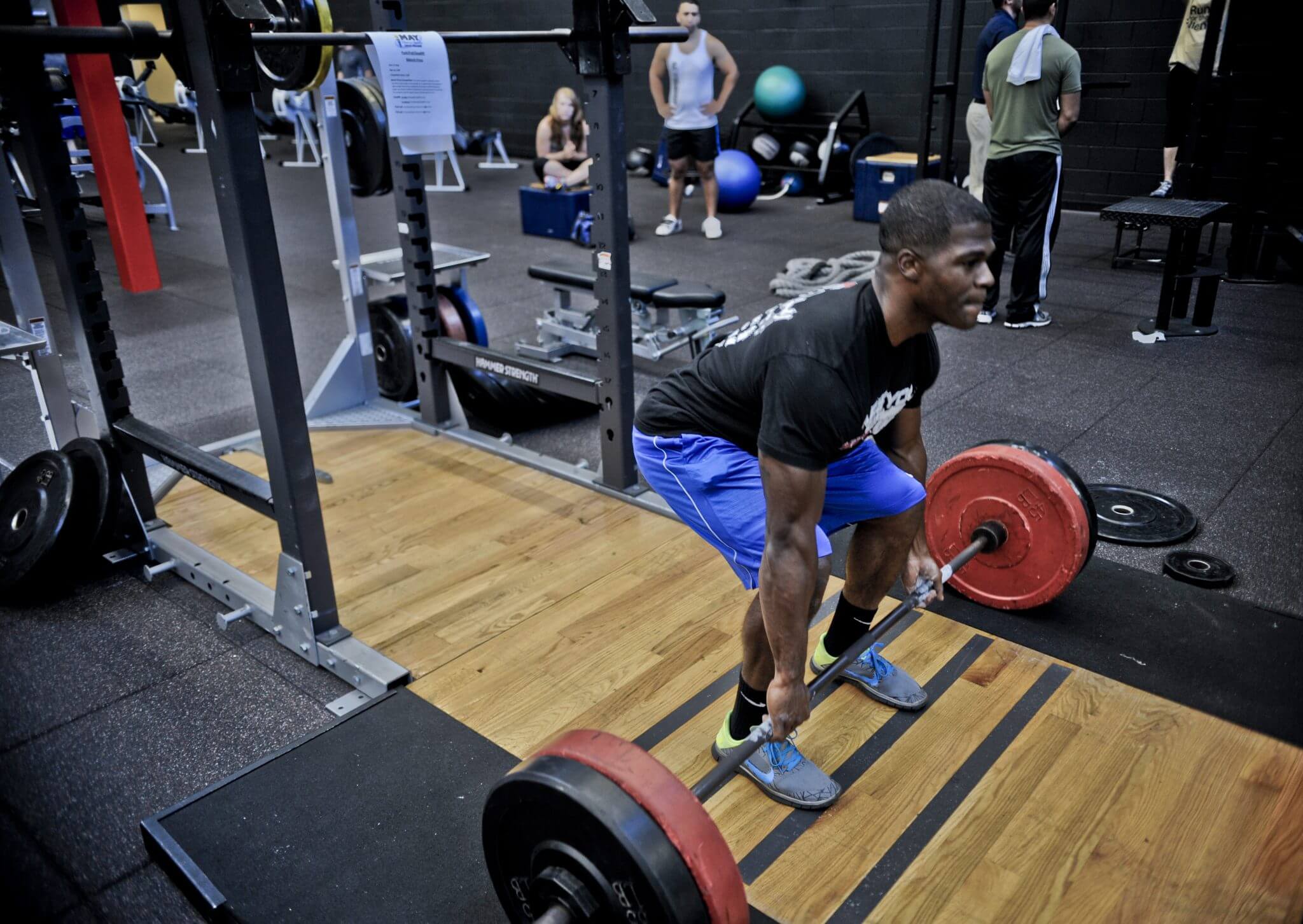
Less torturous, more moderate
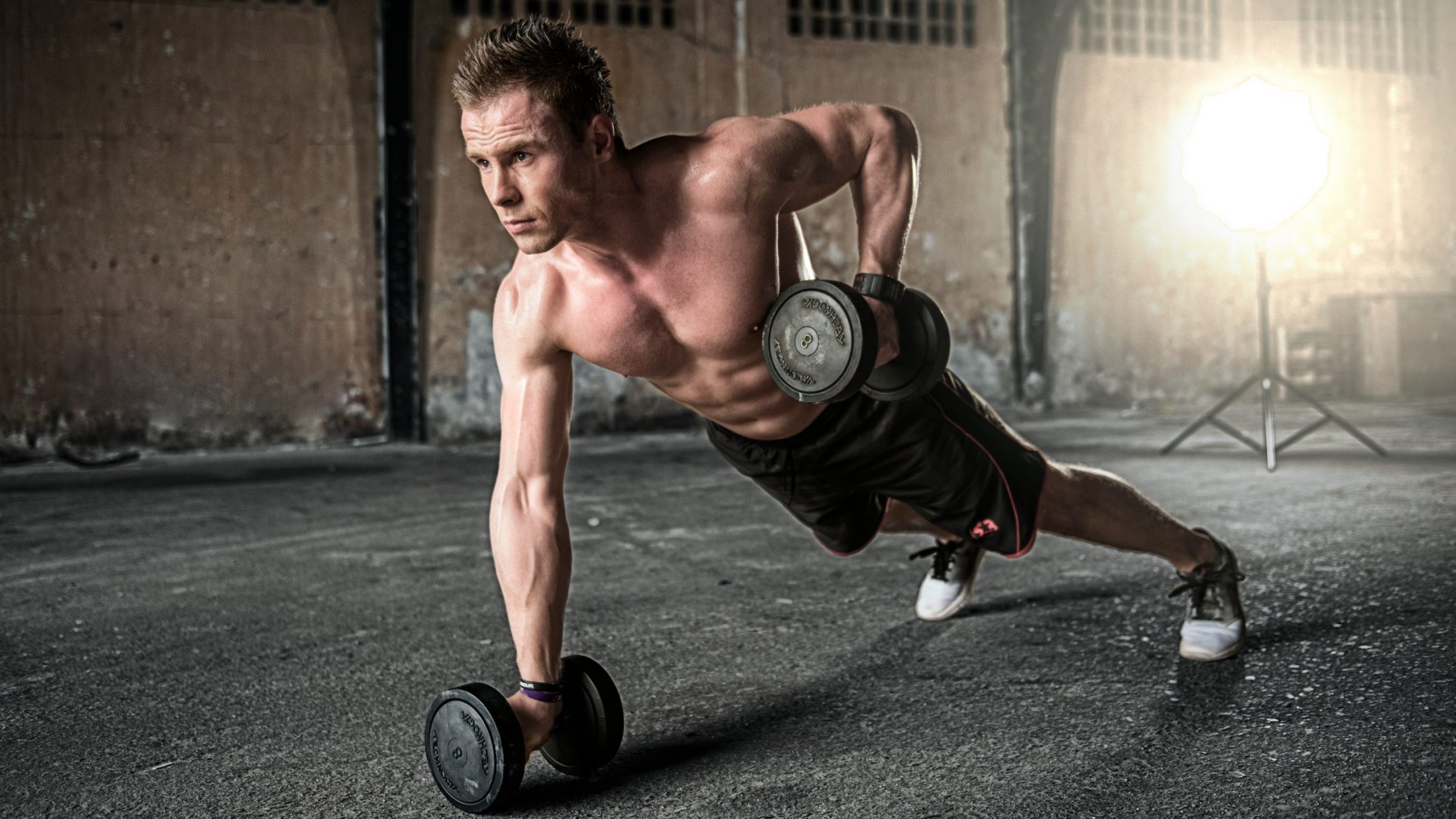
In recent years many of the most up and coming fitness brands were built on a premise of encouraging the hardest and toughest training to push you beyond your limit. Brands like “Tough Mudder” or “British Military Fitness” have cashed in on this and spin or gym classes are often hyped for their ability to cause pain or otherwise tire their victims out.
These types of training are unlikely to disappear any time soon, but they aren’t on the same upwards trajectory as the more relaxed and accessible branding of today. People love to push themselves and get a good buzz, but this has to be balanced out with making long term progress. As more people adopt fitness as a lifestyle rather than a fad, a more sustainable approach is needed.
Flat, modern, material design
Regardless of the type of fitness involved, or even the target audience, the trend towards more minimal branding and logo design continues. Less is more and simple, powerful logos still stand out and allow for better brand recognition. In layman’s terms this means less rough, harsh and textured looking designs and a shift towards clean lines and simple shapes.
Bold or thin?
Most of the fitness brands that have been ahead of the curve have opted for distinctive bold fonts. From Nike to MyProtein, a simple business name in bold goes a long way. This is still just as true as ever. However, in the last couple of years especially, many companies in a range of sectors have opted for the other extreme of super thin fonts.
Overall, it doesn’t look like either of these styles are going to become dominant. While thin fonts are still cool and certainly a little different when compared to more traditional branding, there is still plenty to be said for big and bold, not least that many people find it far easier to read. As with any marketing or design trend, there’s no point just jumping on the bandwagon for the sake of it.
Clearly then, there are multiple acceptable and sometimes opposing directions. The best choice is going to be determined by what works for your situation. It’s still possible to find something that expresses what you’re about that fits in with what’s fashionable. What you don’t want is something that looks really stylish but offers a poor impression of what you actually do.
If you’re a personal trainer, gym owner, nutrition or equipment manufacturer or any other kind of fitness and wellbeing professional, the best way to get started is to get in touch with our team. We’re on hand to provide a fresh perspective on how you can create a powerful brand. We don’t just make logos that look awesome – we build branding that works. Find out more about our branding for fitness professionals, or learn more about our fitness marketing services.