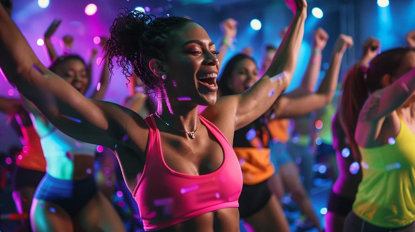
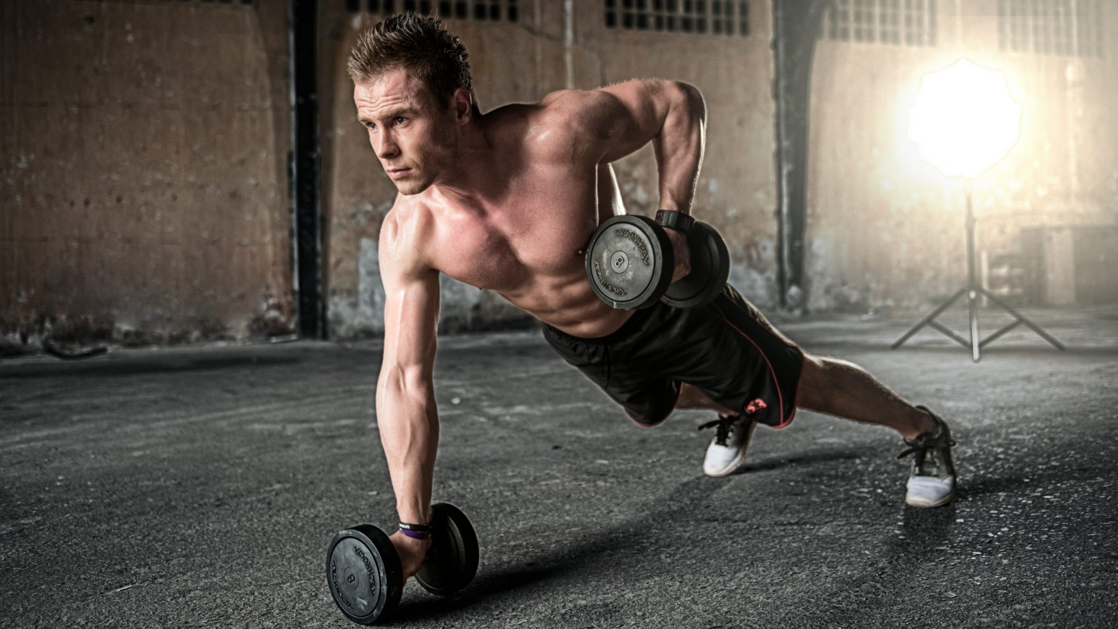
If you’ve read Part 1 of our tips on designing fitness branding you’ll know we’ve worked with a number of different fitness professionals, from strength trainers to private gyms and fitness nutrition specialists. As fitness enthusiasts ourselves, we love working with brands in this world. We’ve recently put together a few tips for fitness professionals looking for branding and logos for their businesses.
Whenever we work on a design, logo or branding project for a client, be they a nutritionist or a strength coach, we start with competitor research. We know and love the fitness industry well, but it’s a big industry. Every niche has its own design conventions and in order to operate at the forefront of design, its essential that we stay up to the minute with them. Drawing on this knowledge, we’re going to continue our design and branding tips for fitness businesses here. Remember, creating great designs that resonate with your customers is just like training, you’ll need to take a bit of time looking at the bigger picture and getting the basics down, so make sure you take on board all these tips to ensure the time and effort you commit to your branding is well spent.
Keep your colour palette limited
Creating branding and logos is fun and exciting, so it’s easy to flood your mind with hundreds of different options, from minor changes in typefaces to different layouts. Try not to get lost in colour choices. Many of the most successful gym and fitness brands stick to only a couple of different colours. You don’t have to make up your mind right at the start of the design phase, but try to limit yourself to a small selection of colours to experiment with and try not to use more than 2 in each design. The aim is to create a simple association in the mind of your customers. Think of Pure Gym and their distinctive turquoise branding, their well-executed, simple colour palette clearly identifies their staff and locations despite the competitive industry.
Be sure to get your logo as a vector file
Whatever happens with the creative side of your logo and branding designs, there’s also a more practical side to be mindful of. You’ll want to make sure to get your logo and fitness branding sent over in a format that works everywhere. Vector files are great because they’re based on a mathematical formula that scales flawlessly. With today’s high resolution mobile phone screens, 4k monitors and ‘retina’ resolutions, a vector is the best way to ensure that wherever your branding is seen, it’s never pixelated and always looks professional. Vectors are also great for printing, they’ll look great on giant posters and signage right through to business cards. If you’re new to vectors, a designer can certainly help you with them.
Consider your fonts
There are tons of amazing fonts out there and you’ll probably be keen to experiment with loads of them in your branding. There are a couple of practical considerations to be mindful of though. Did you know that some fonts require a license? Yes, it is possible to ‘own’ a typeface, someone at some point had to create every font you see, even this one.
Many fonts, such as Google Fonts, are accessible to all without a fee, but some of the more specialist fonts cost money. It’s not always a huge amount and it can certainly be worth the investment, there are loads of really stunning ones out there. Whatever you go for, make sure you do it by the book. If your designer has a license for the font you’d like to use in your branding then great, go ahead. Just remember that this is not the same as your business owning the license, so you won’t be able to use the font on your website and other channels unless you license it yourself.
You can compare the fonts found in your branding, with Google’s and try to find a similar one to use on your website to keep costs down, or ask your designer to base your logo entirely around Google Fonts if licensing fees are an issue. Even if you have a licensed font in your actual logo you can still use Google fonts for the header and body fonts of your other marketing materials. Which brings us to the next point.
Build your wider branding style
Keep in mind that your logo is just the start. The colours, fonts and styles you go for here will need to be carried through into everything. From matching the colour of your branded t-shirts, to determine the key colours on your website to fitting out your fitness premises. It’s important to get your logo and branding right at the start because if you have to start changing any of these wider marketing resources further down the line it’s going to be a massive pain. A logo might look small, like it takes no work and that it’s an area to save a few quid but in reality it’s the lynchpin that ties together literally all your marketing and therefore fundamentally determines how people perceive your business.
Keep an eye on our channels for more gym, personal trainer and fitness business marketing tips. We can get enough of fitness here at Alloy Marketing, from strength training & HIIT sessions to nutrition and nootropics, we know the world and speak the language. If you’d be interested to work with a team of designers and website experts who love fitness, get in touch for a no obligation chat about our fitness branding services, getting your fitness business more online leads with organic local SEO services for gyms, on a larger scale for multi location businesses we offer national SEO services for gyms, social media management for gyms and PPC management services for gym and fitness brands.
Find out more about our fitness marketing services and our previous work.